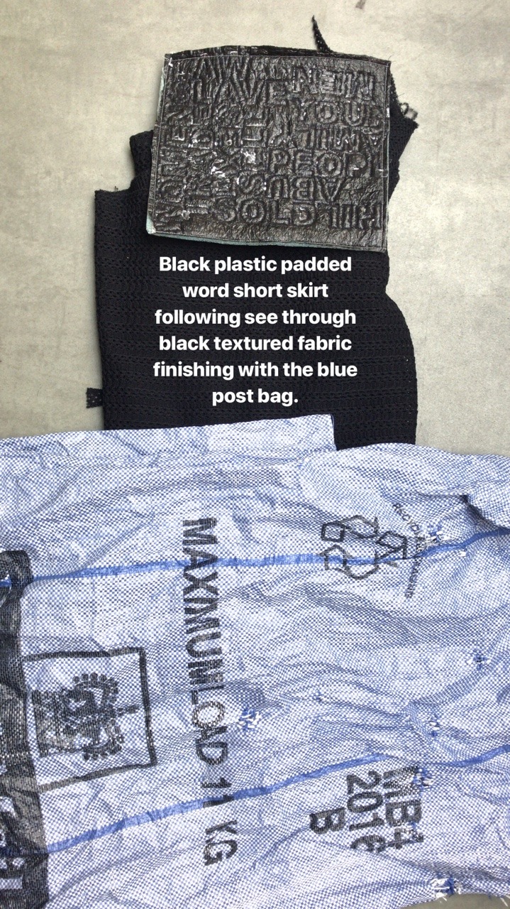
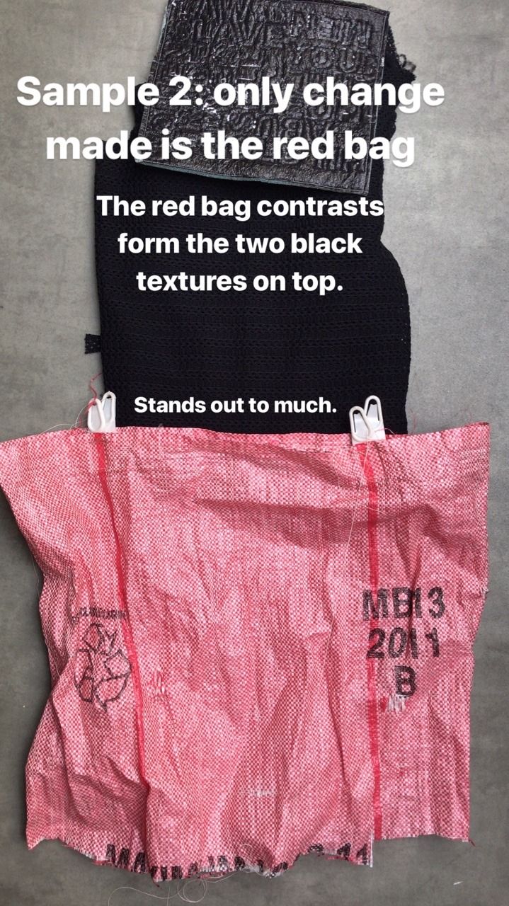
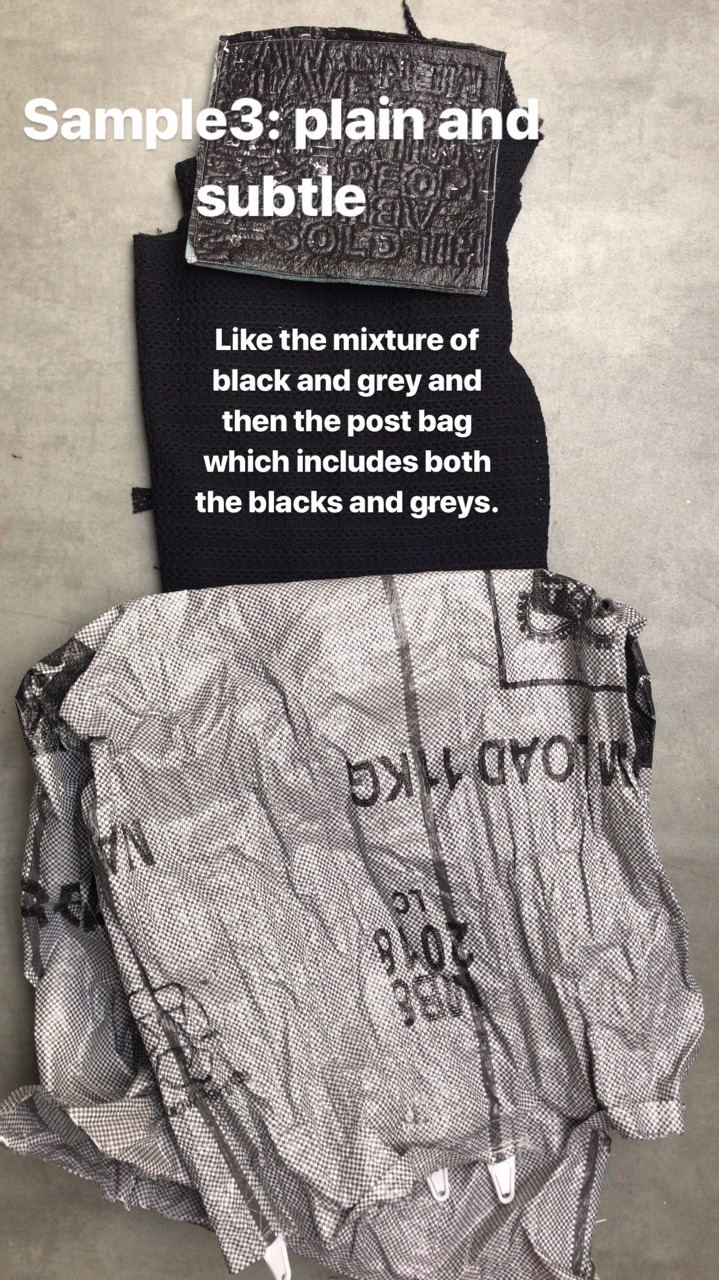
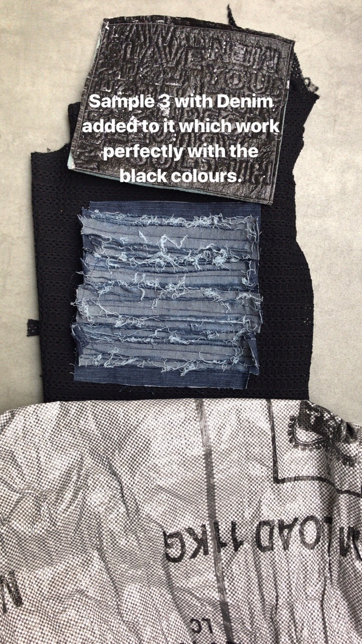
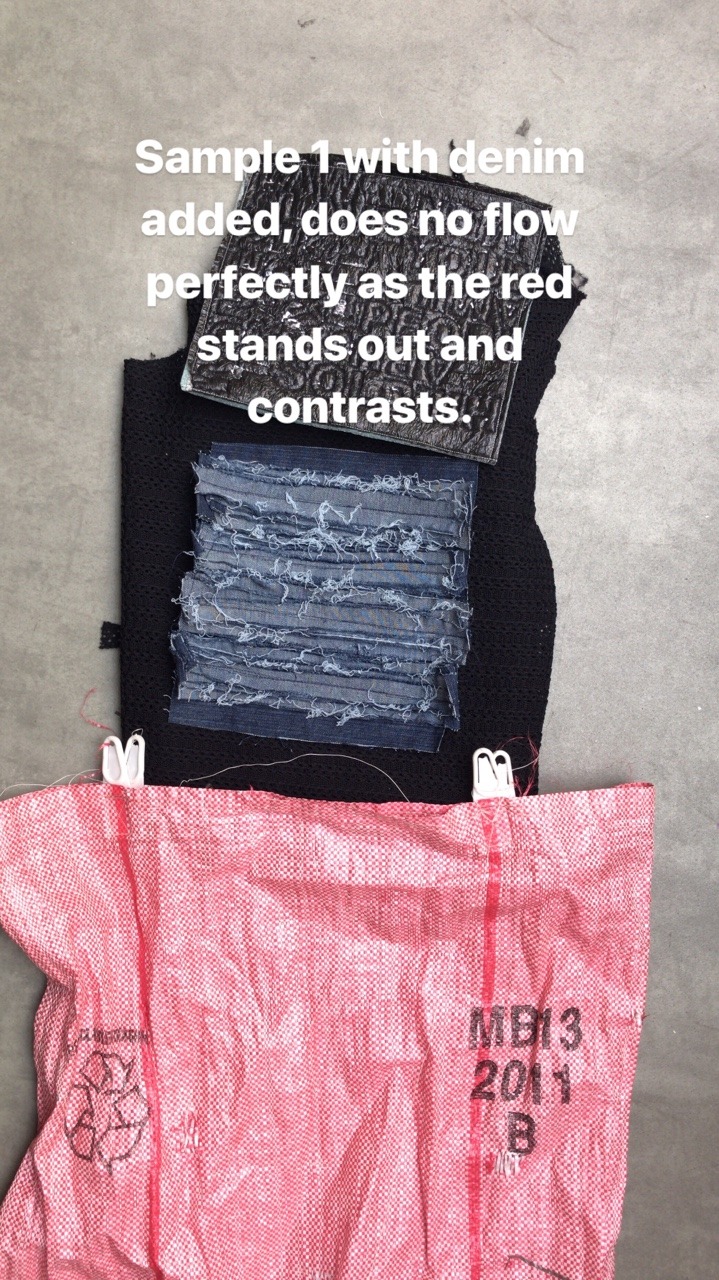
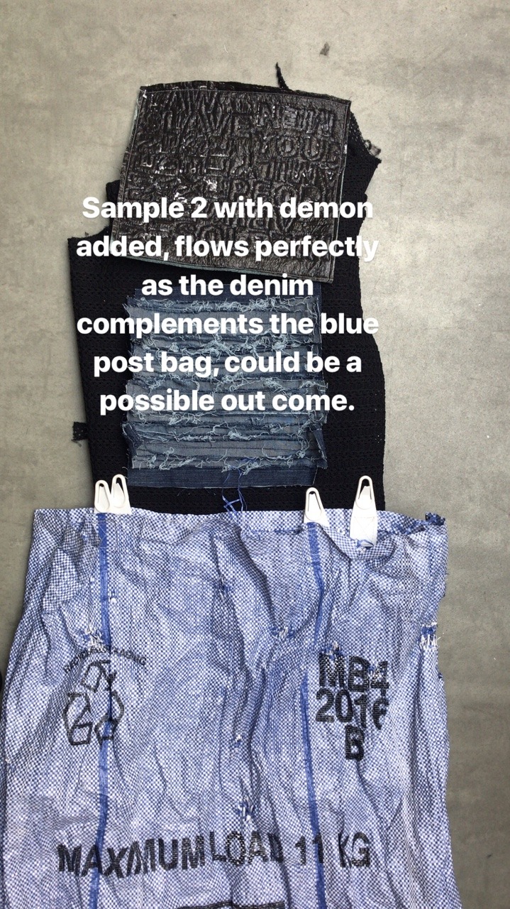
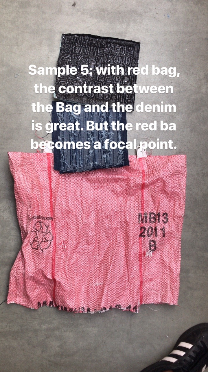
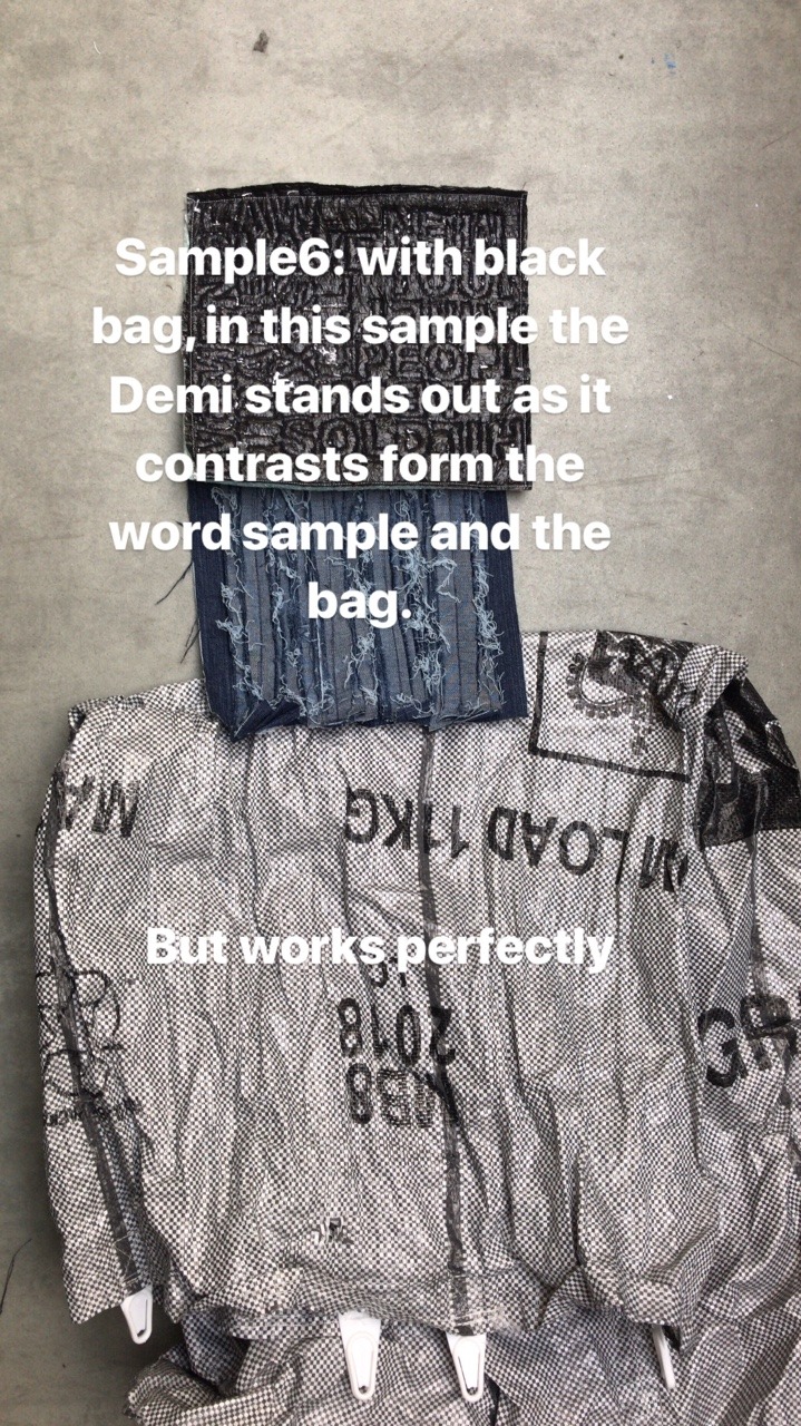
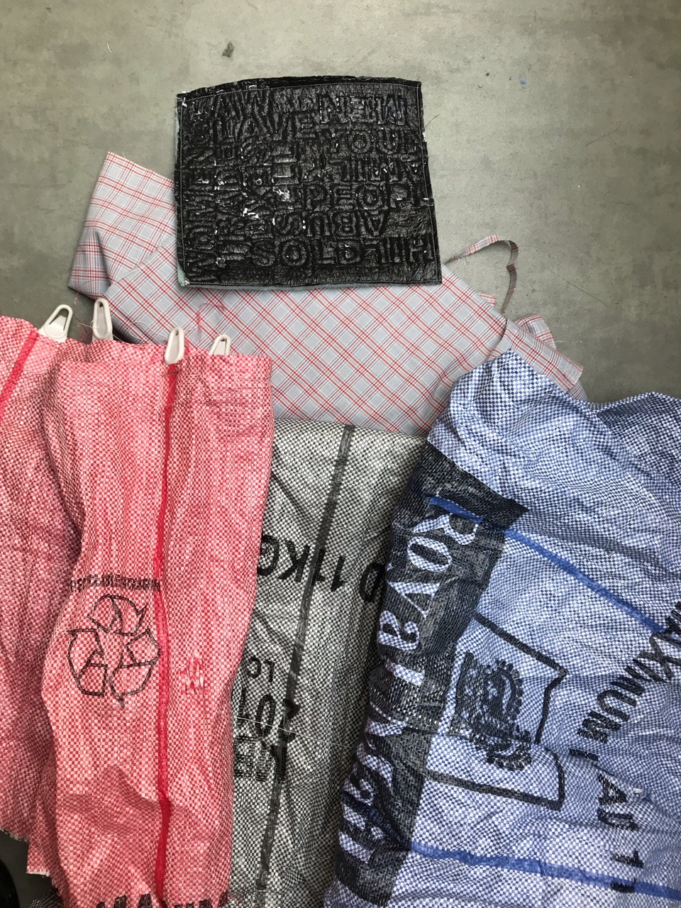
This me testing and matching the best colour combination for the skirt. As the previous colour pallet was out of the range.
Form the samples above the first three images with different colour postbags all of them look attractive in their own way; as each bags colour gives you different feel. As after experimenting with the sample the blue bag drifts of the design and the colour pallet, the red is to bright and attracts attention from rest of the colour pallet and finally the the grey bag is bit dull but flows with the design colour pallet.
Moving on to the second row are the same images but with a denim sample on the black translucent textured material. The best one is the one with the blue post bag as the denim sample compliments the blue bag. Whereas the other two coloured the red contrasts with the denim and with the grey post bag the denim stands out more.
The last row is sample by deductions of the translunt material as the denim material is the skirt.
The final colour palette choice for the skirt will be sample 3 with or with out the denim kangaroo pocket which I need to decide on
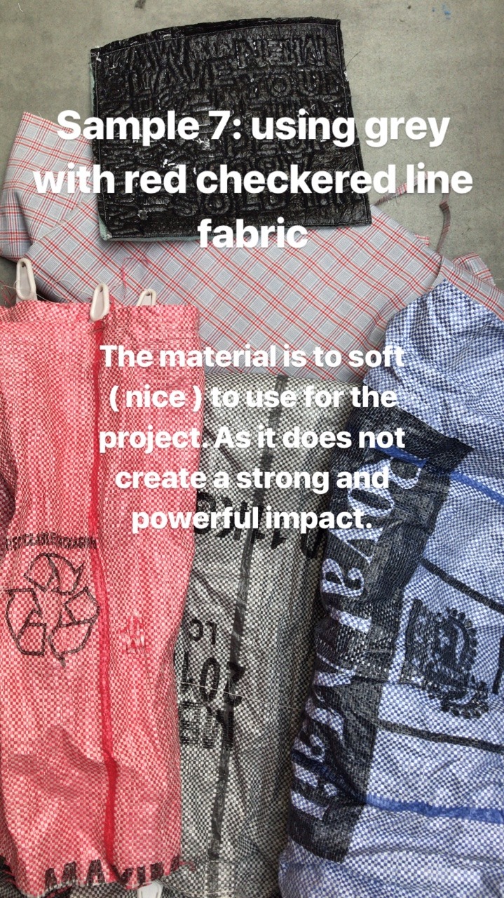
In this sample I have change the translucent black textured fabric which the grey and Red Cross strip fabric; personally it does no display strength and empowering as it’s more subtle showing fear, therefor will not be using this colour for the skirt.
