Para Bellum and Tigran Avetisyan.

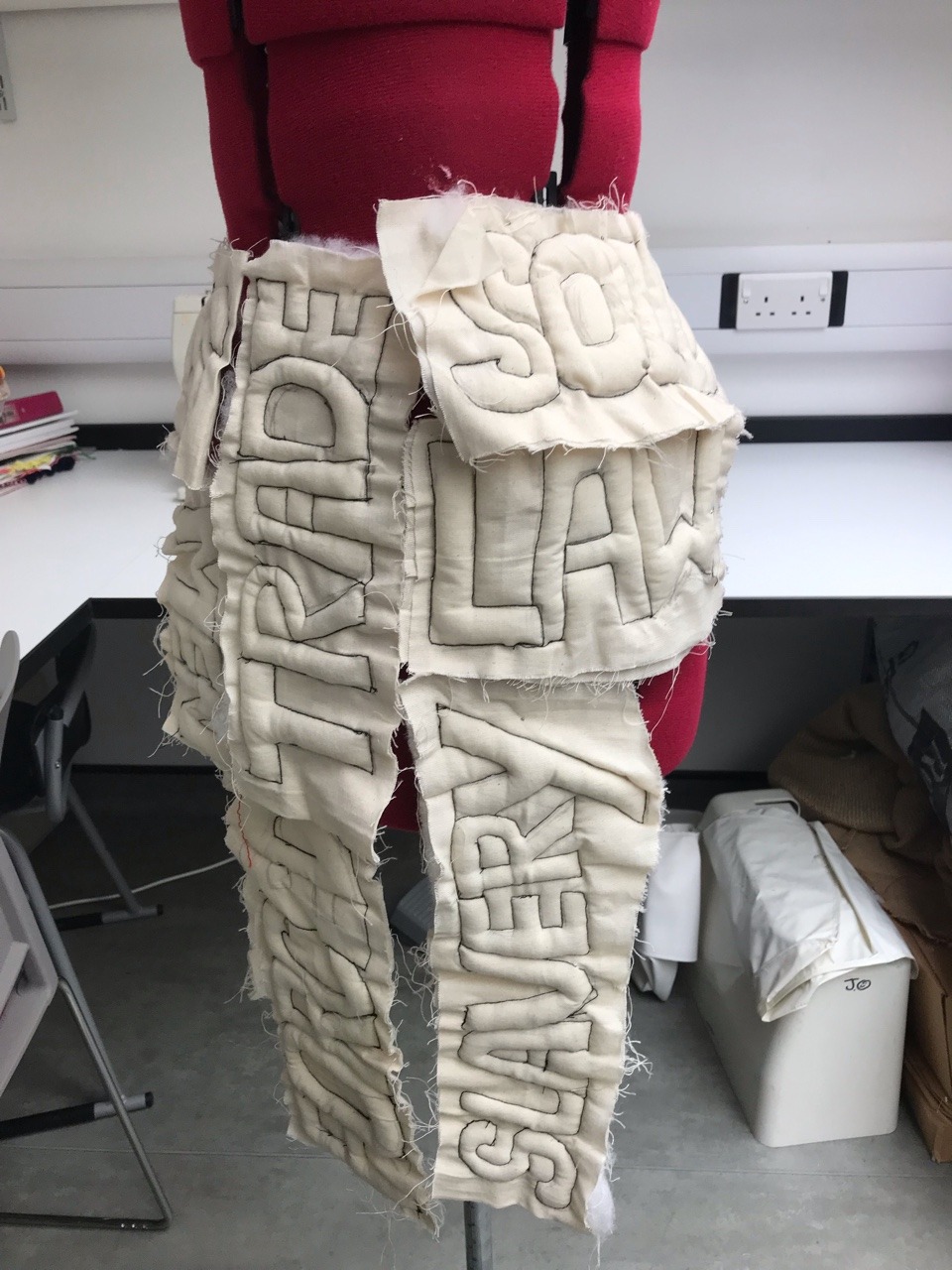
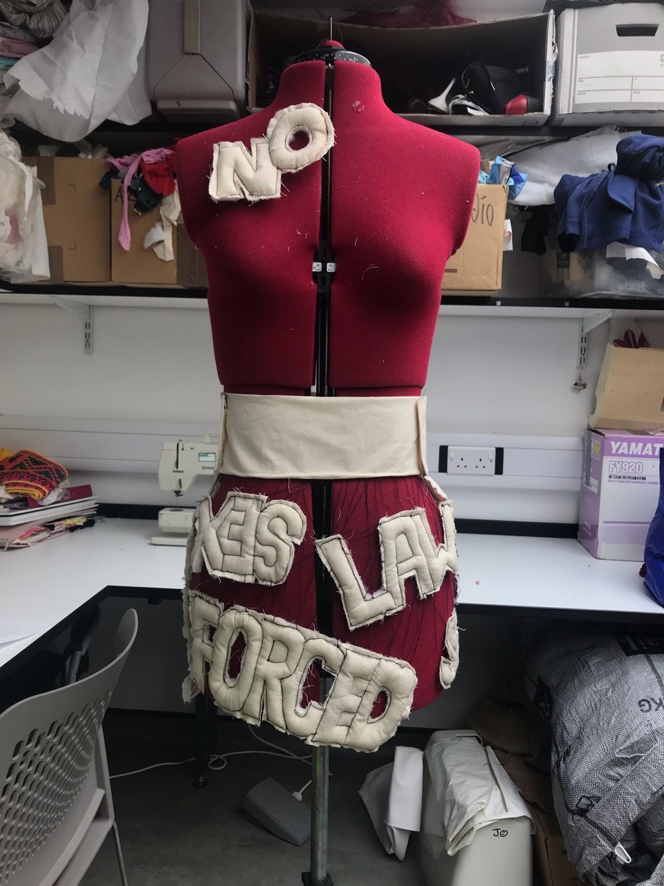
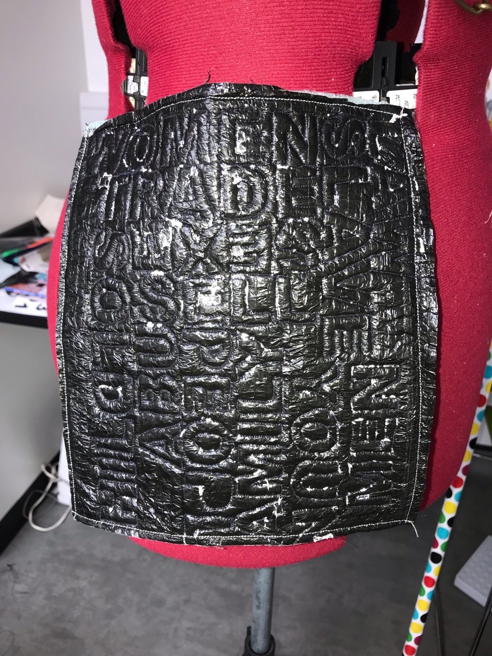
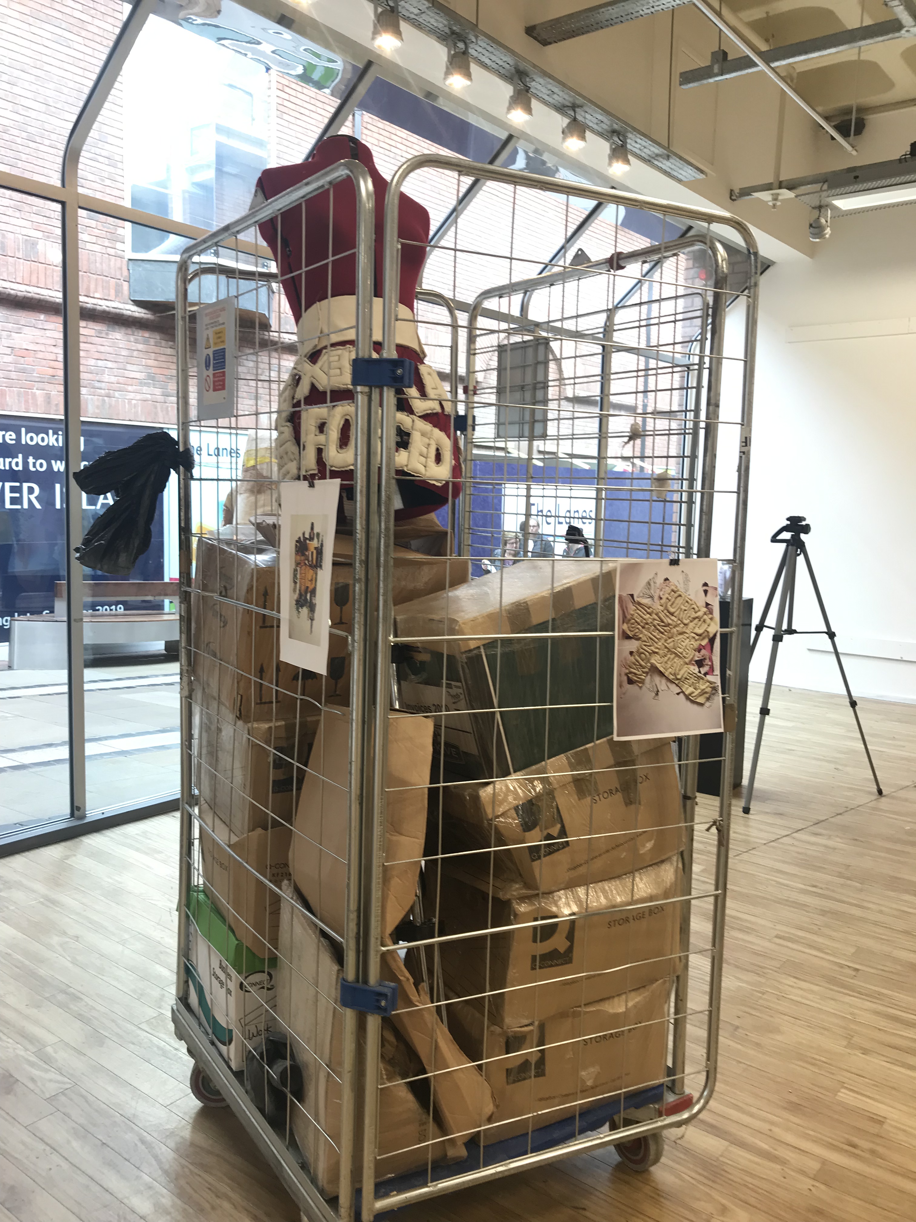
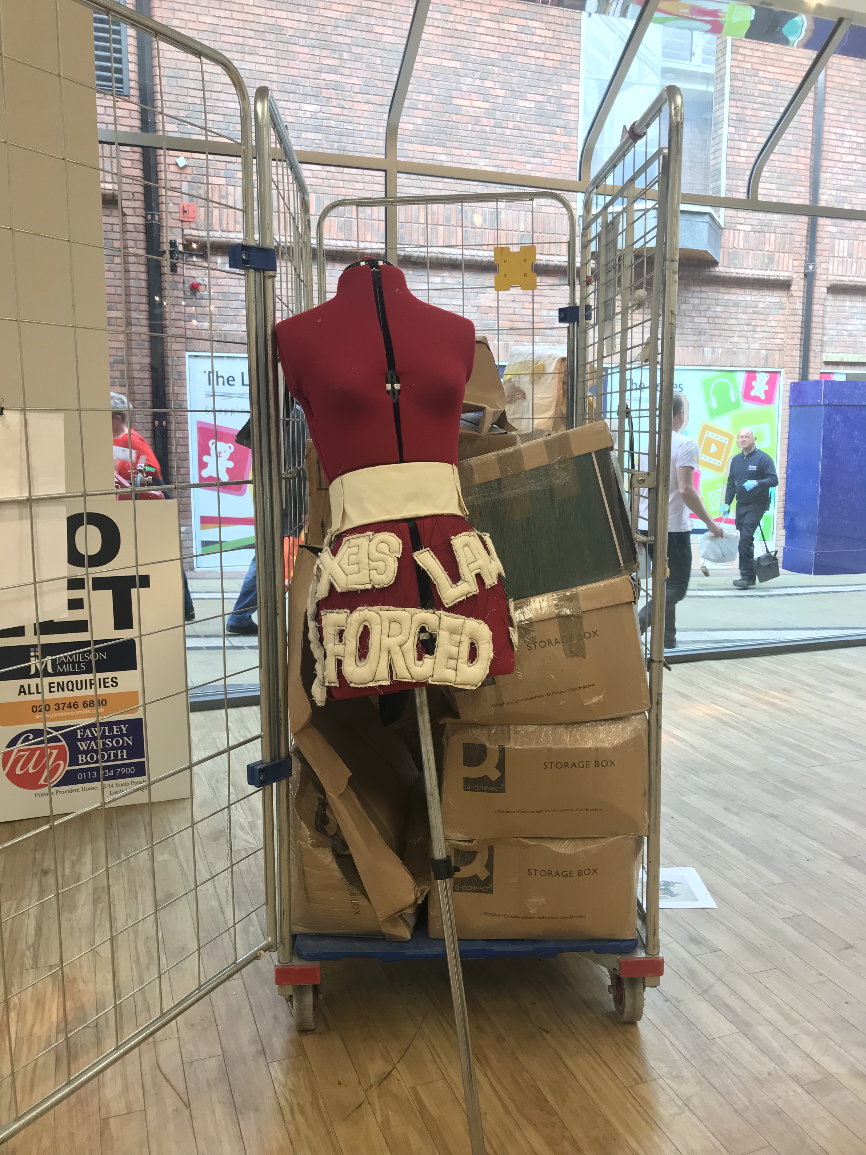
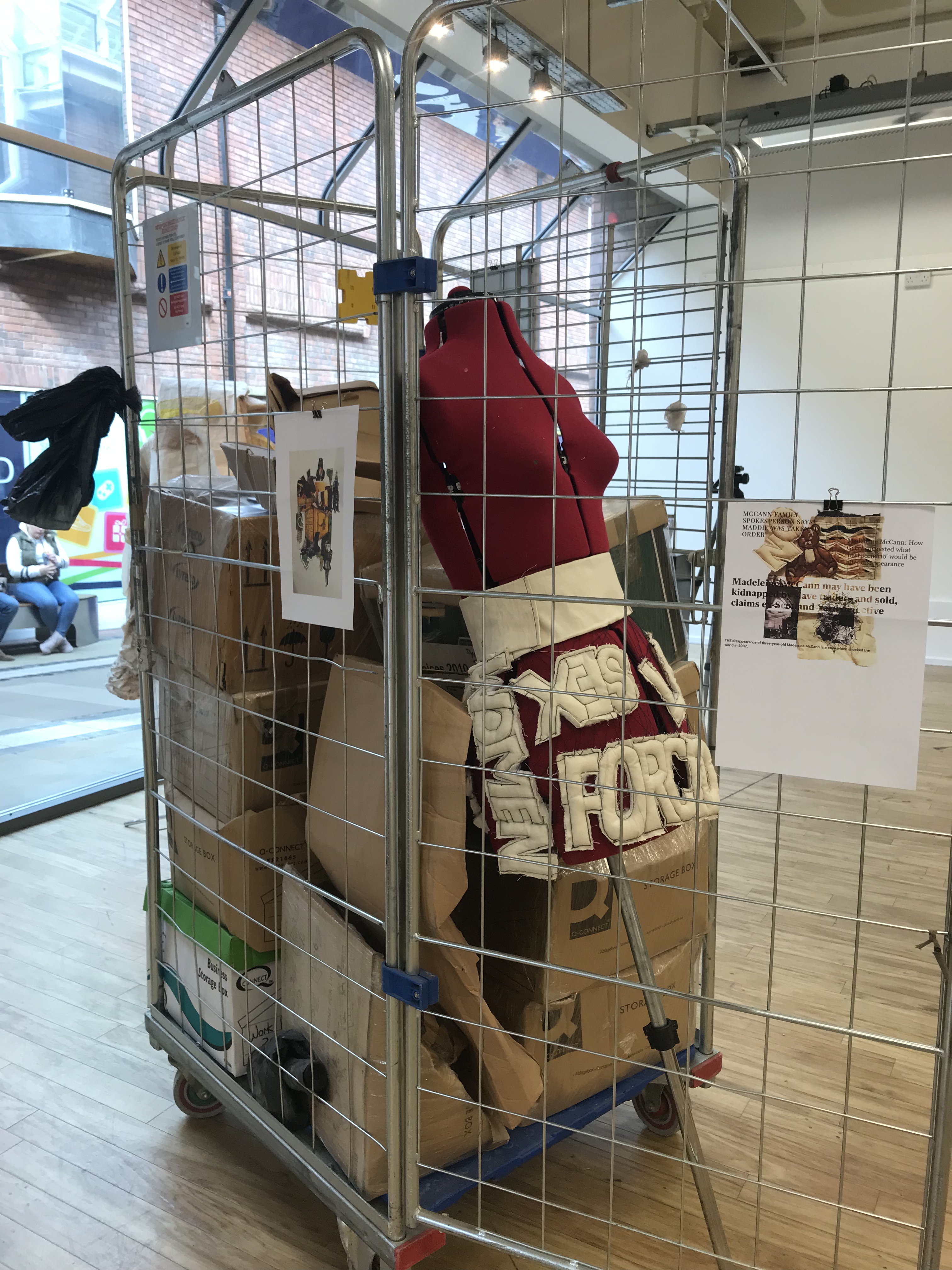
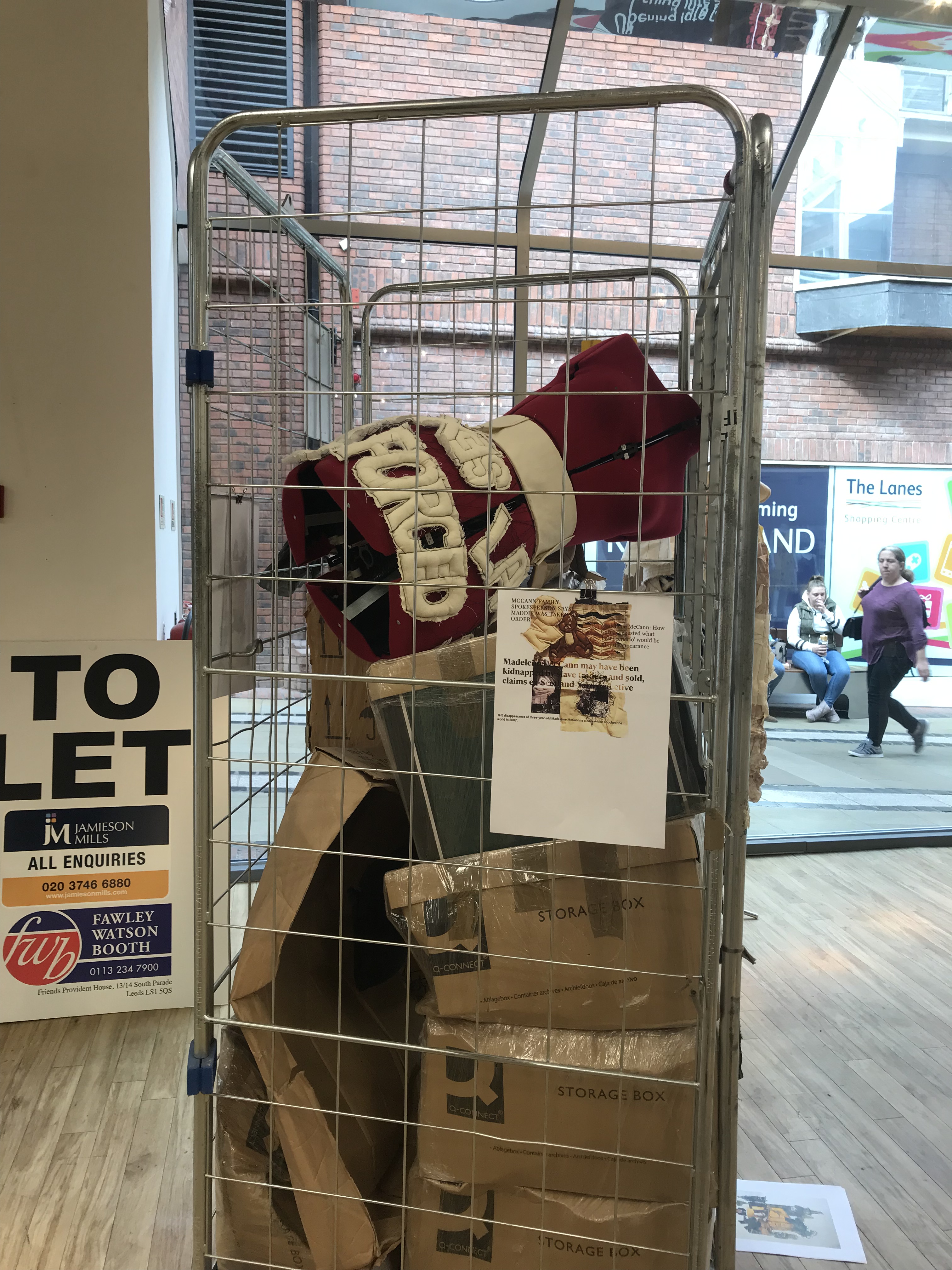
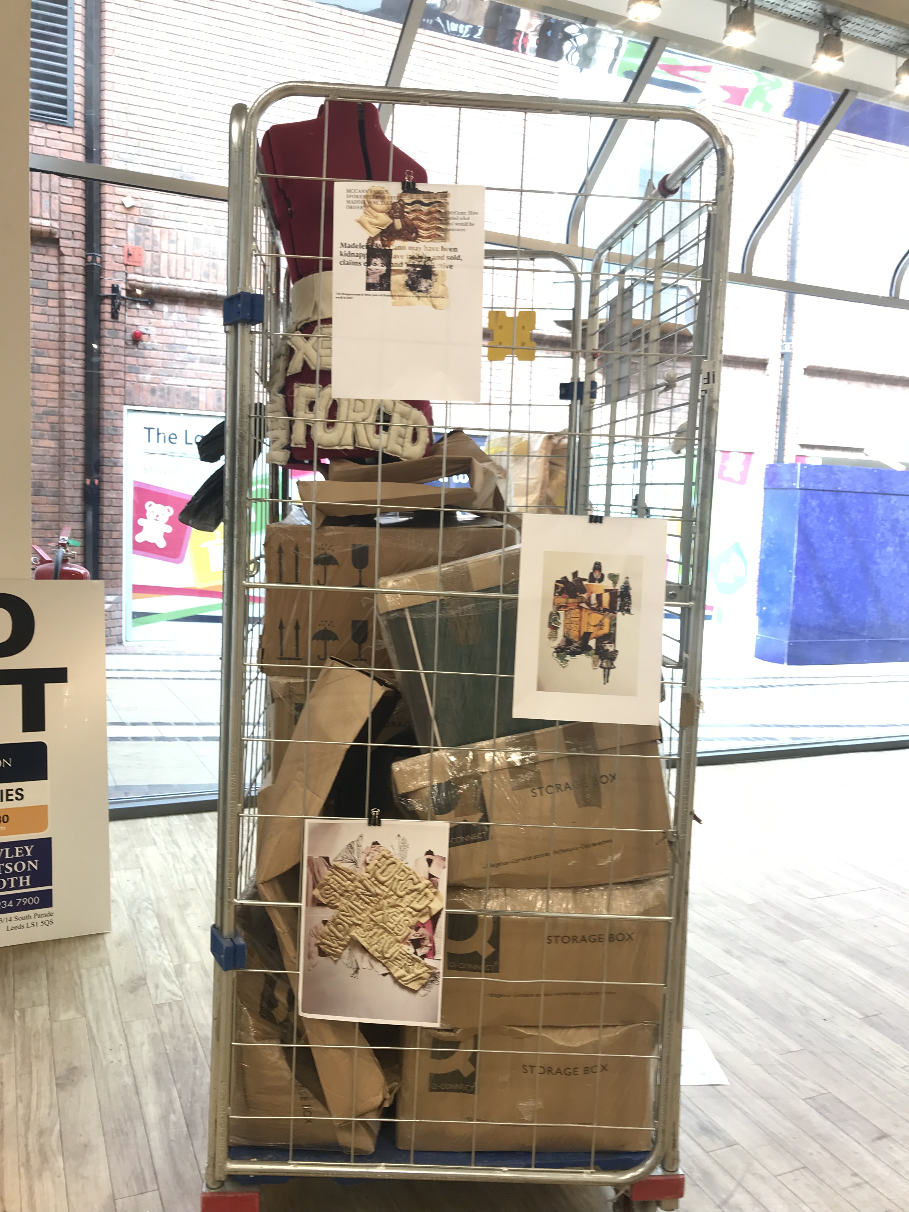
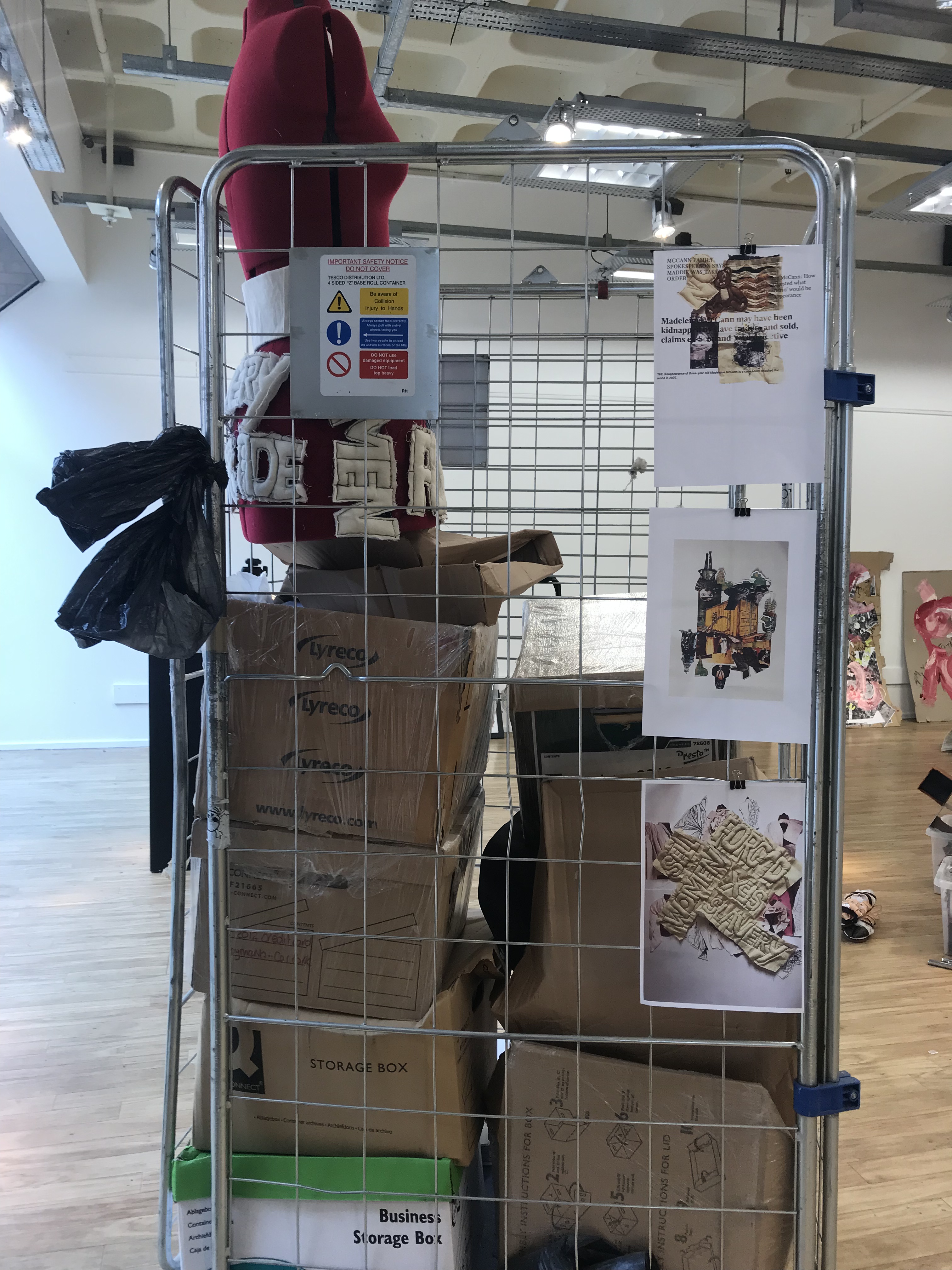
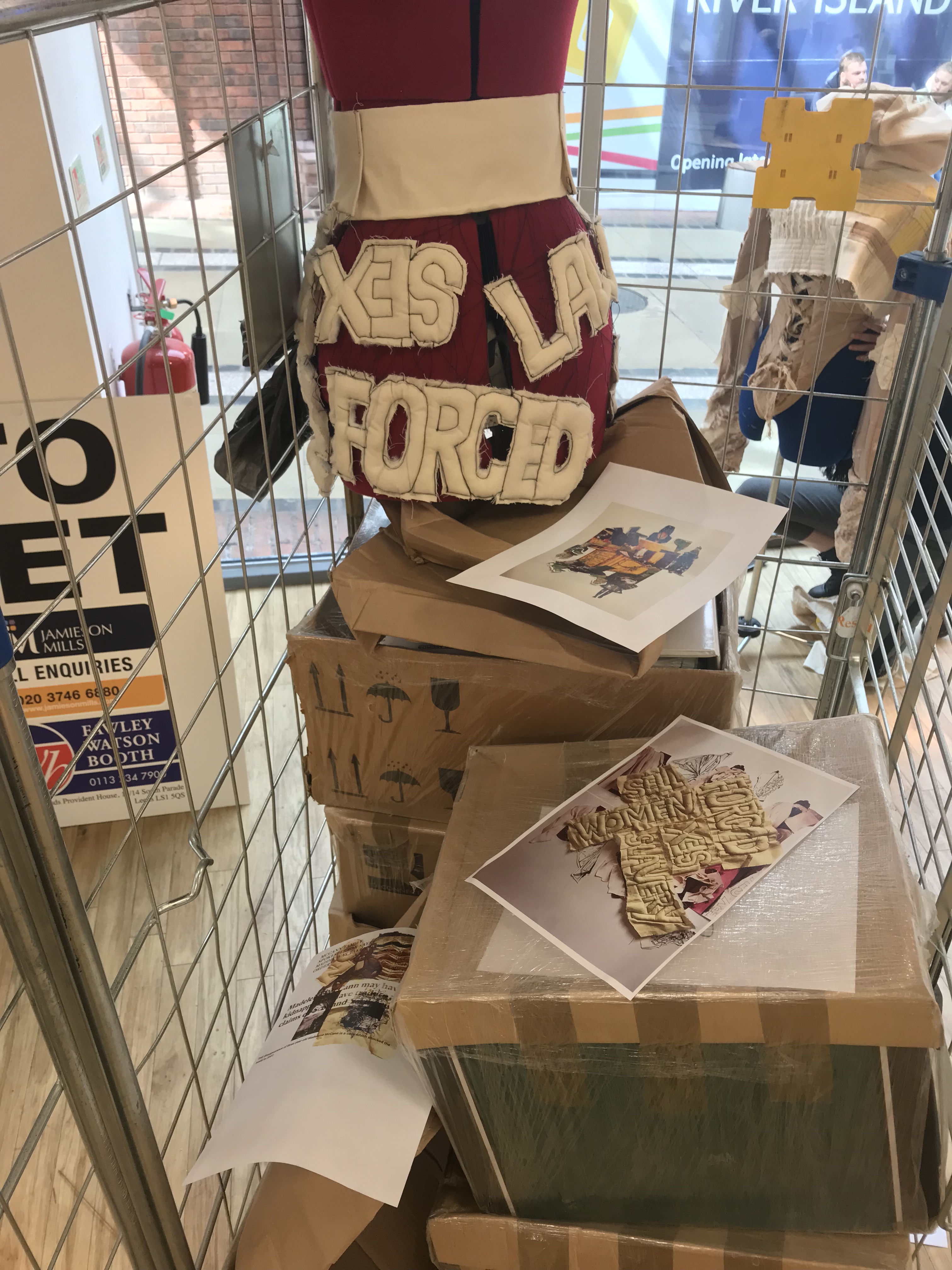
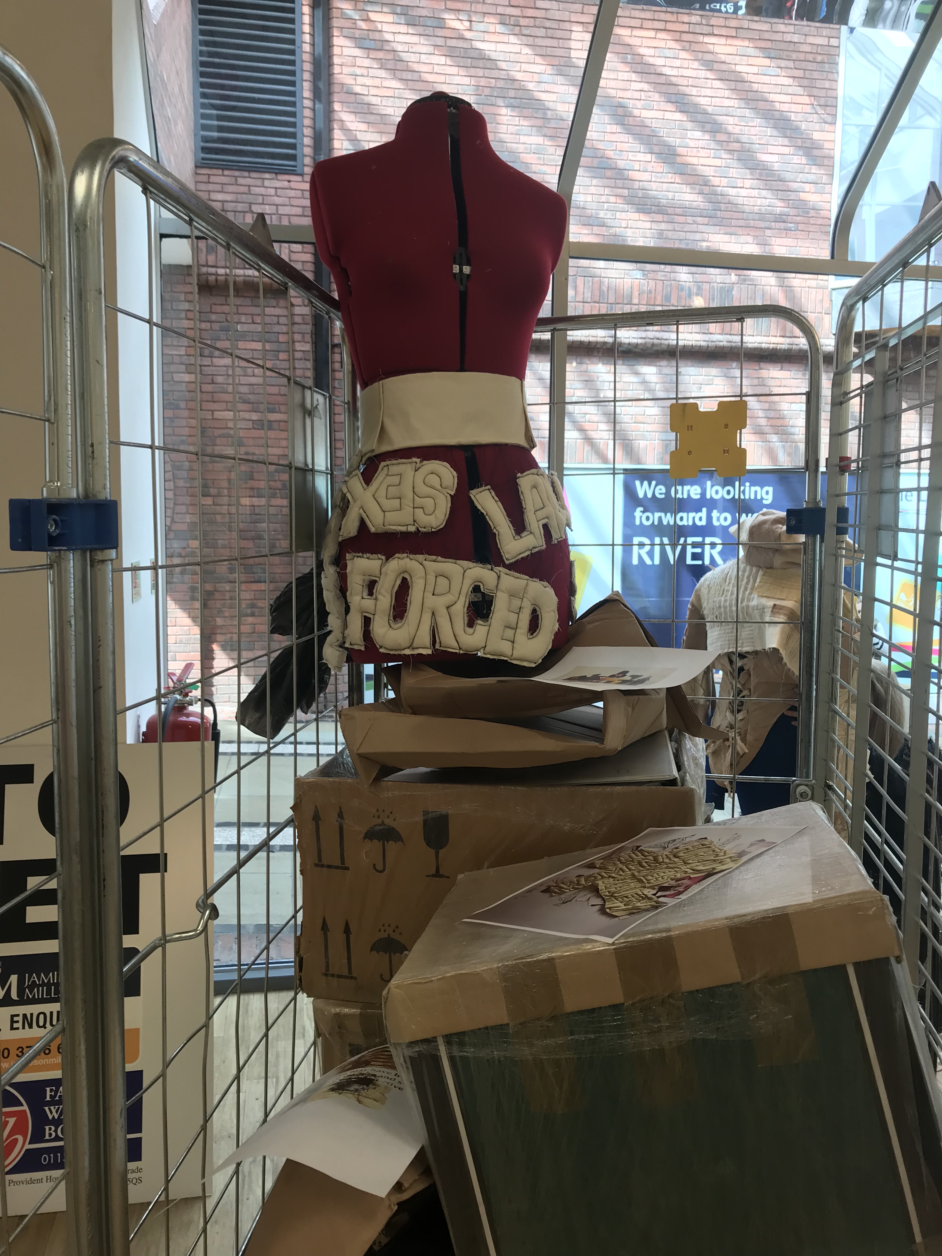
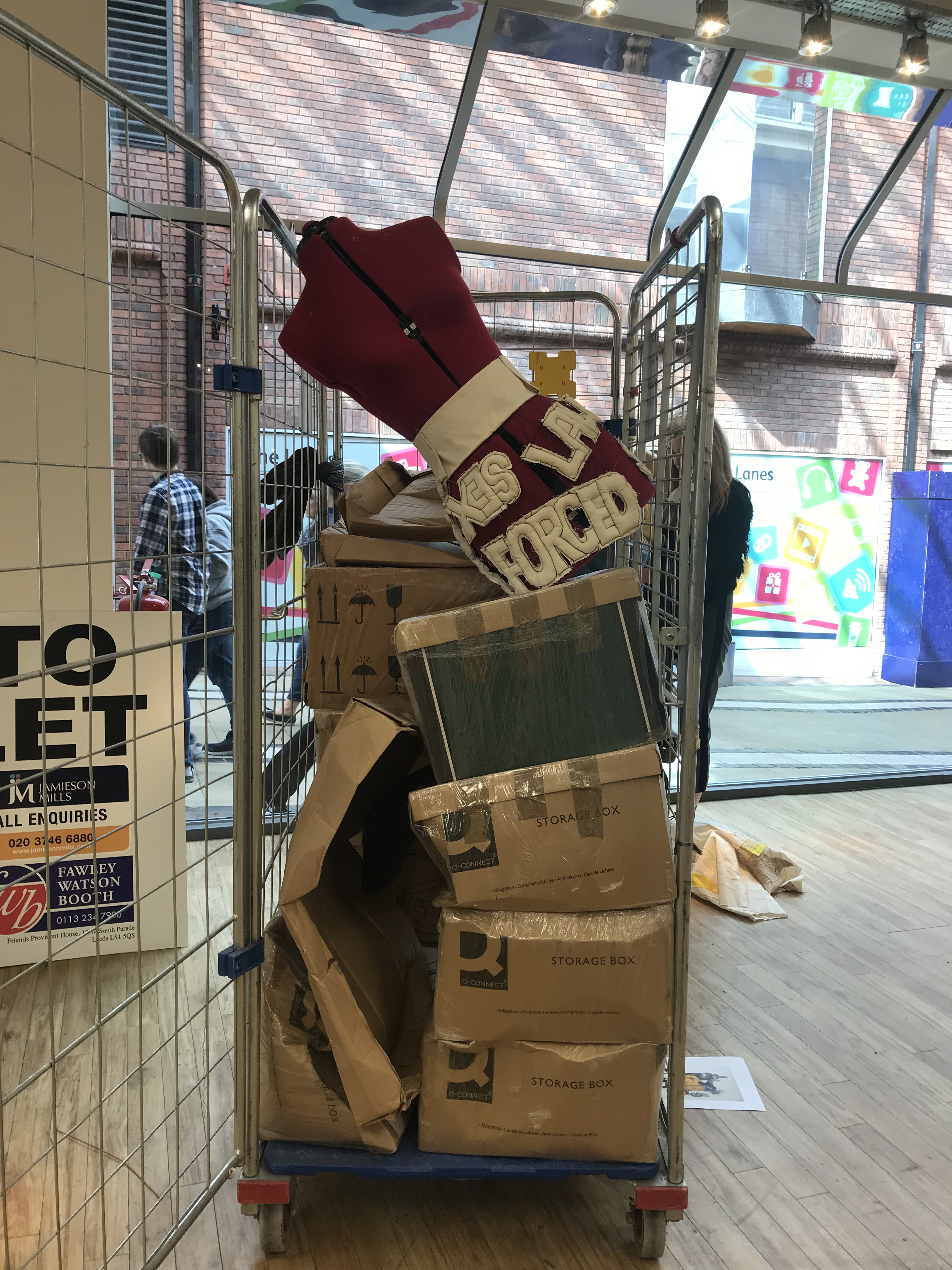
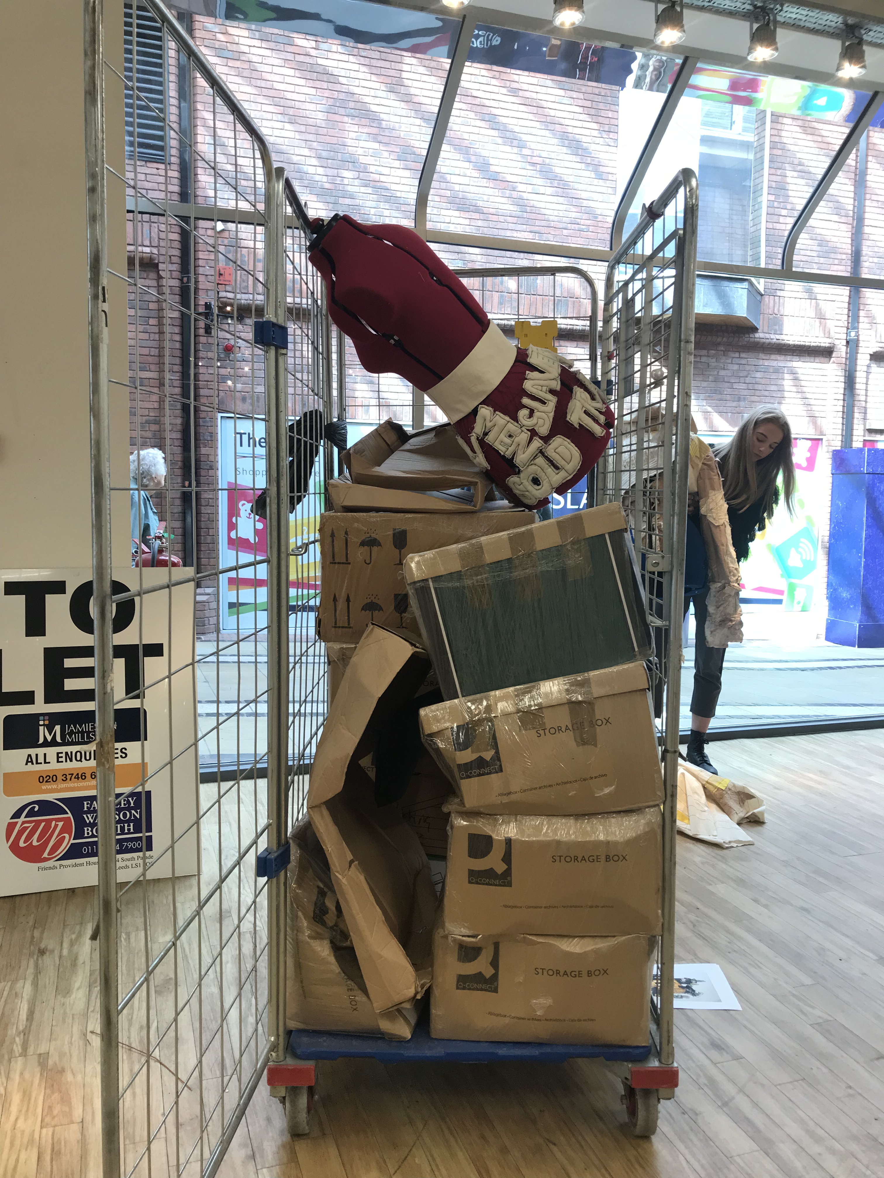
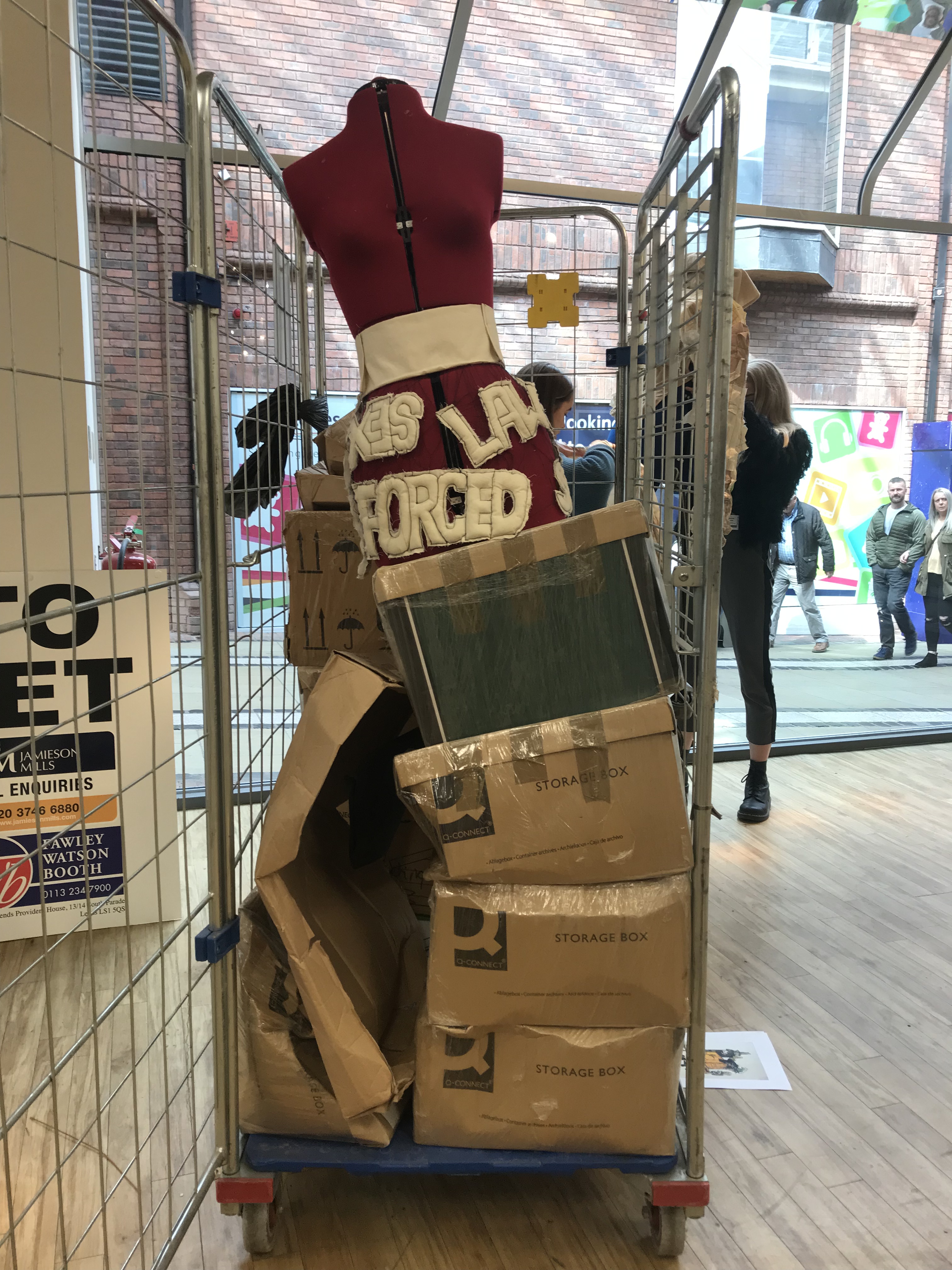
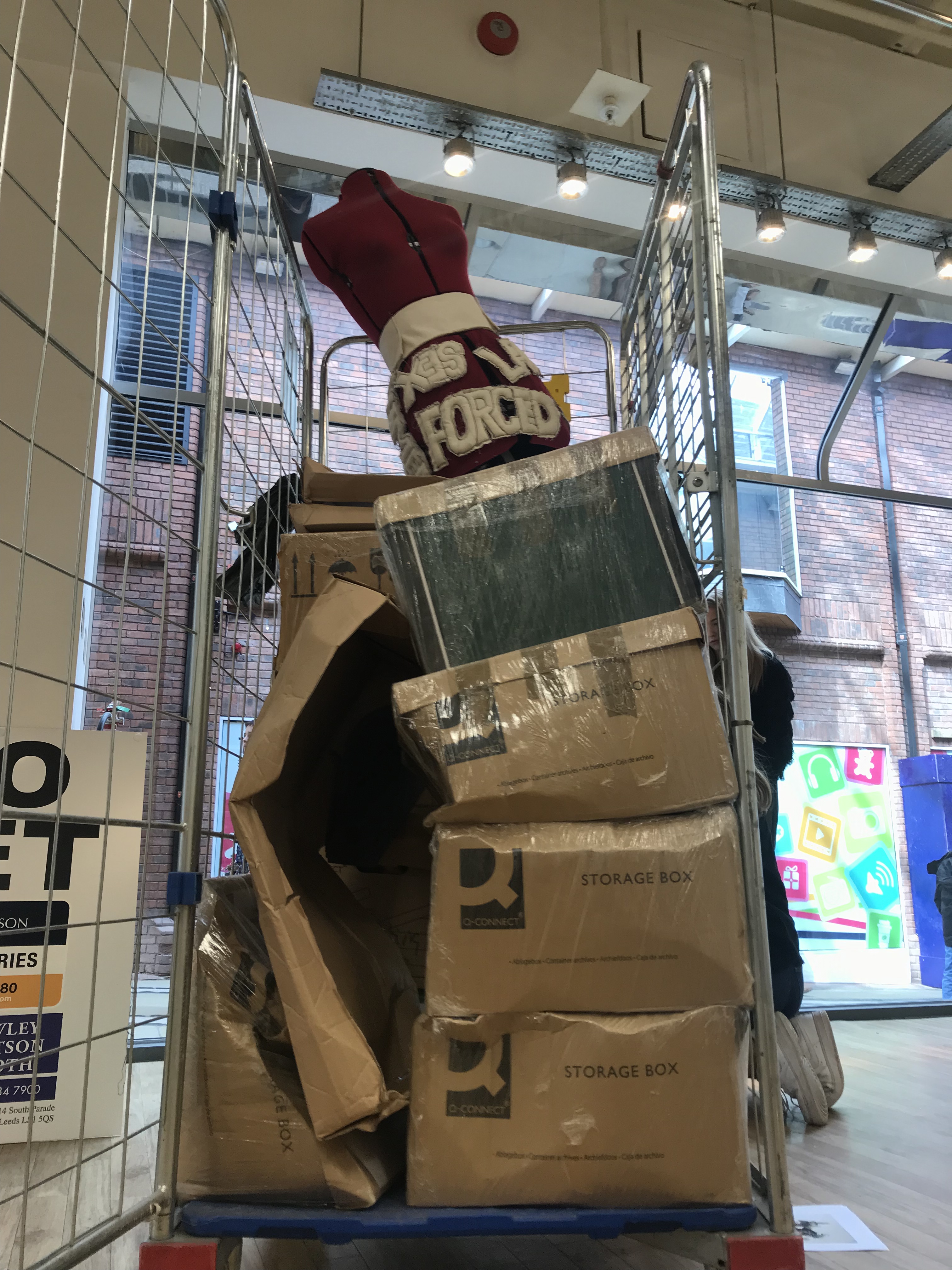
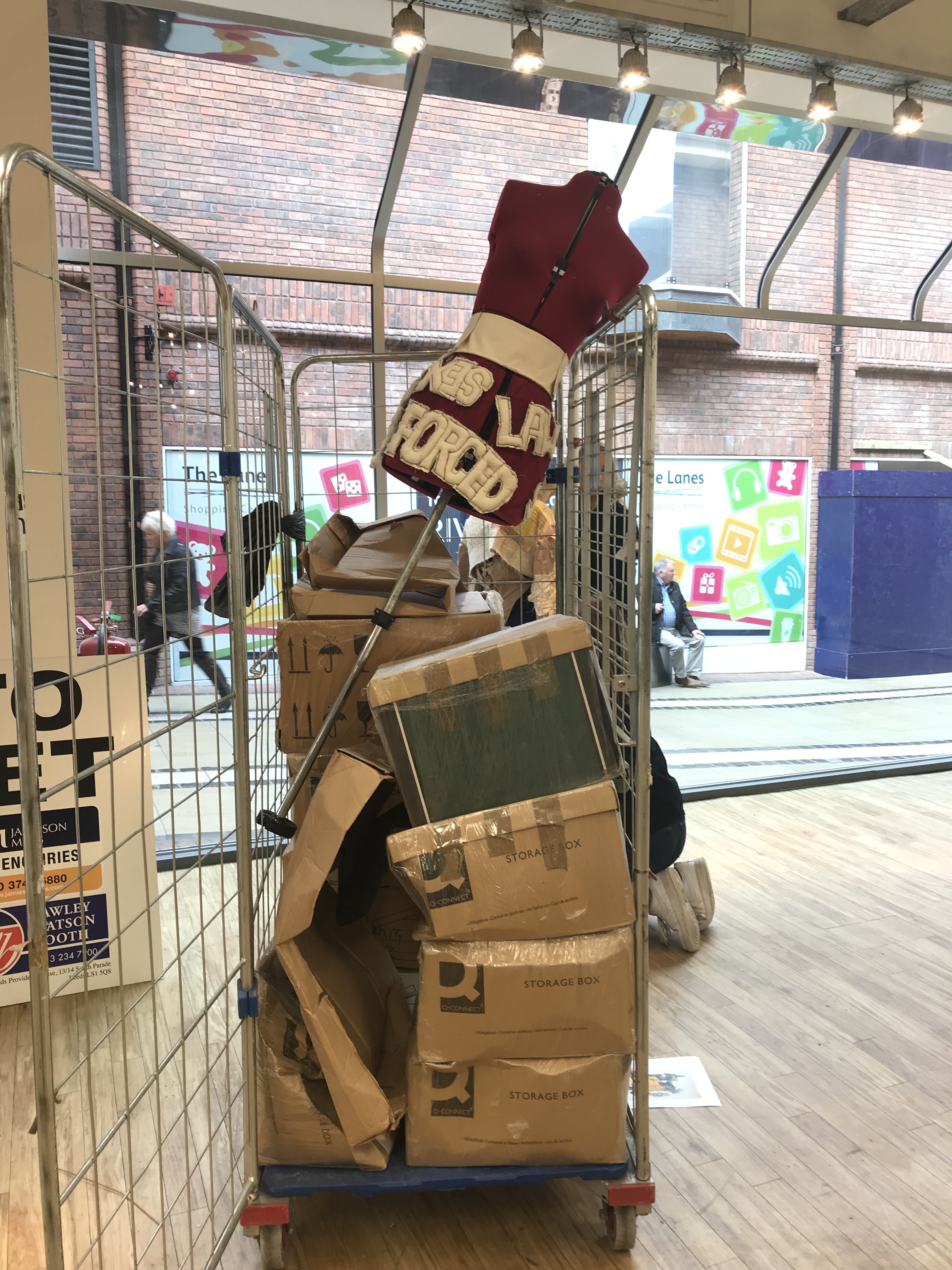
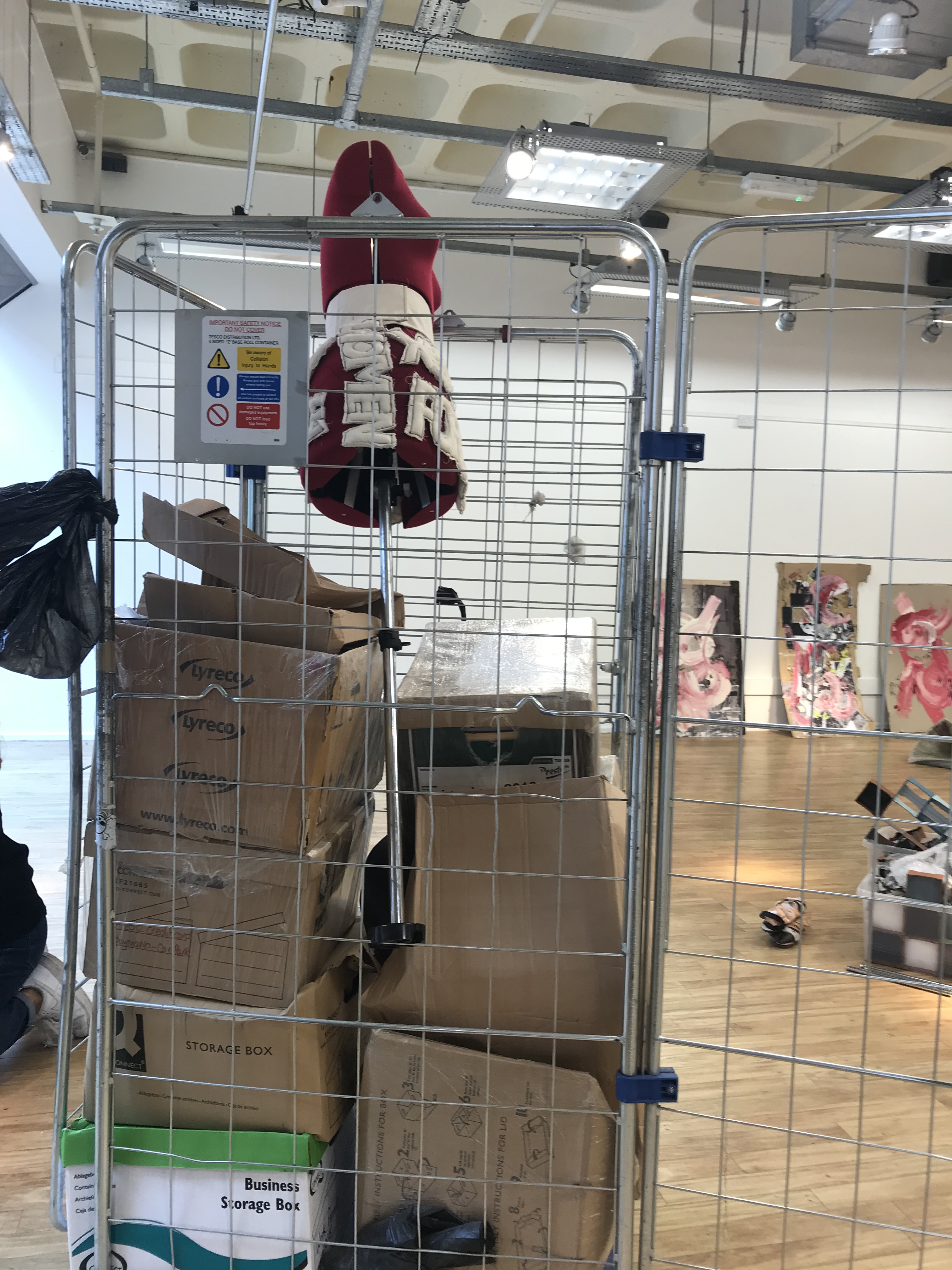
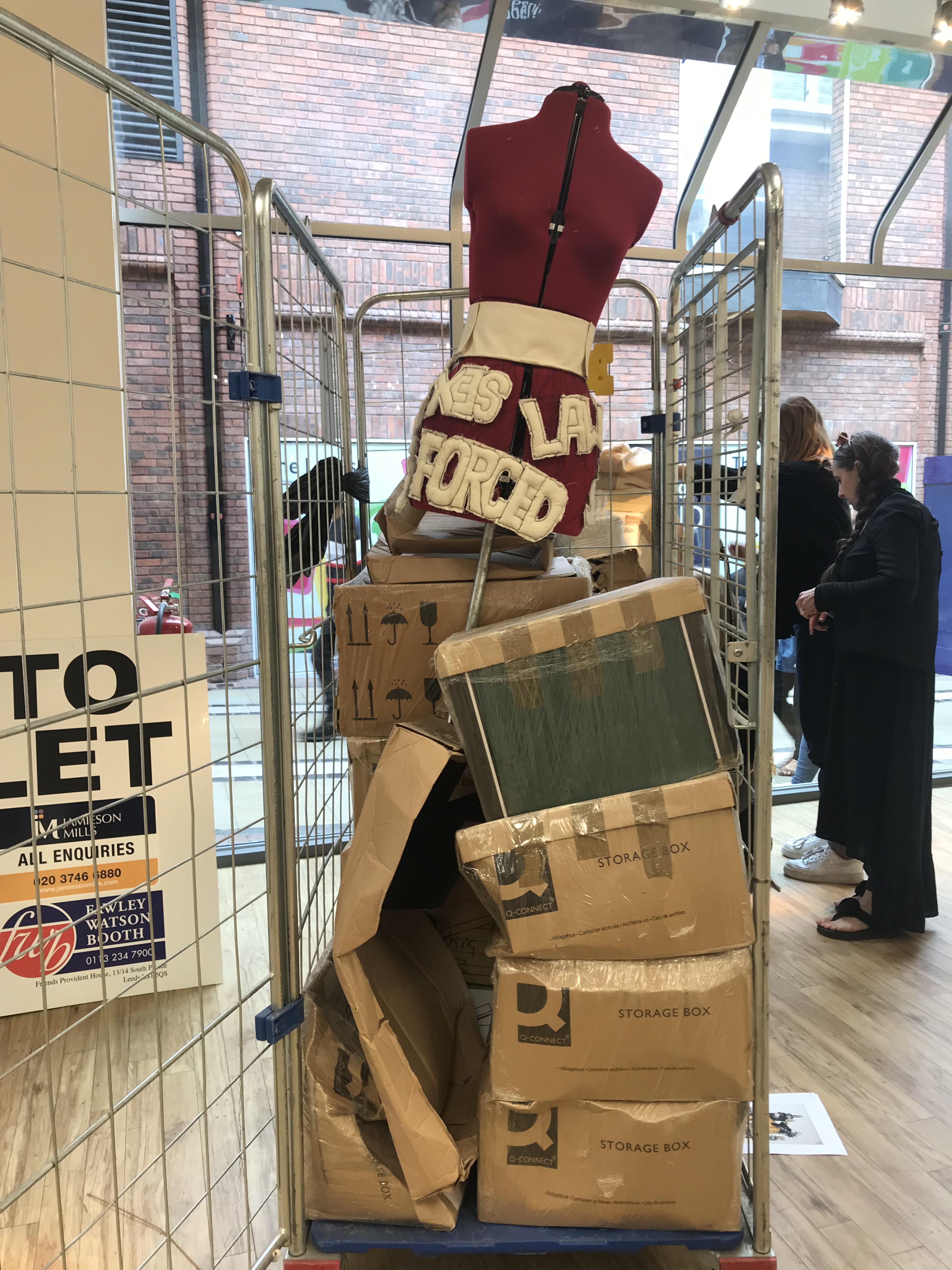
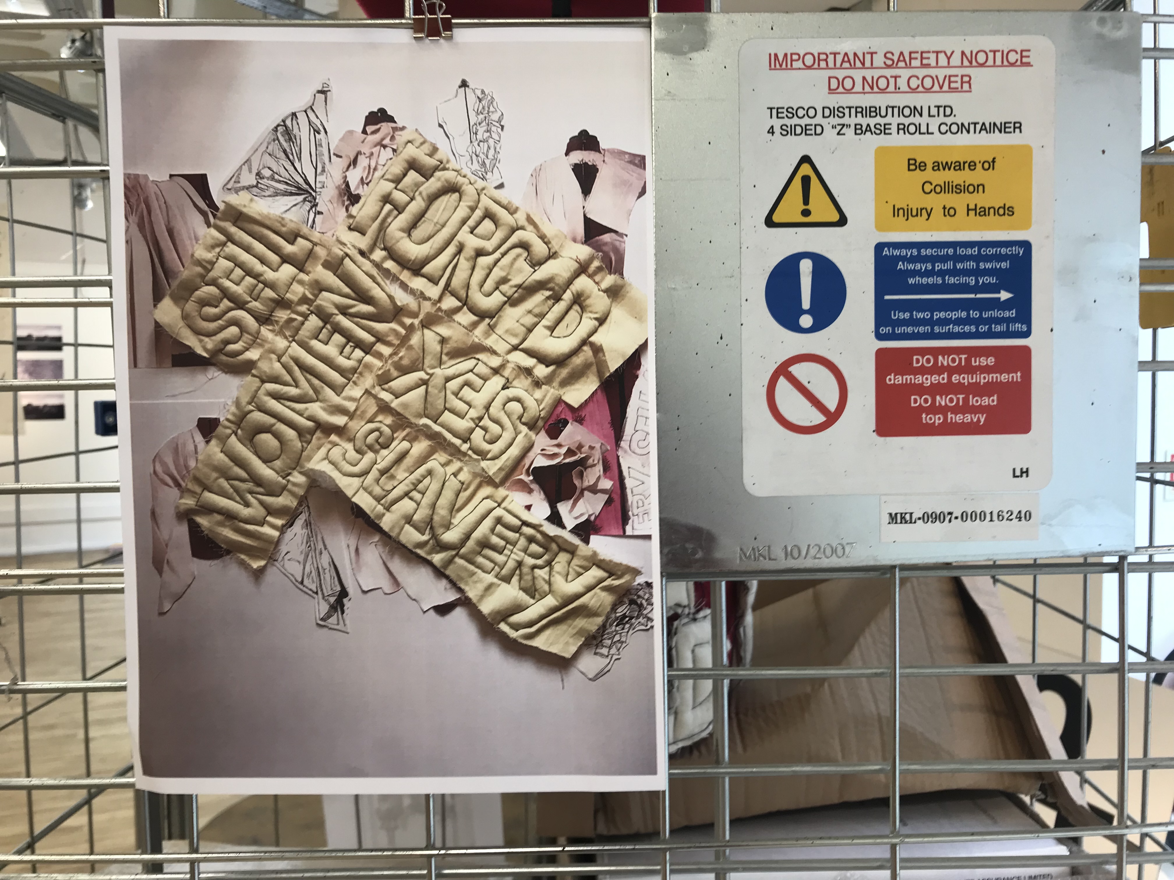
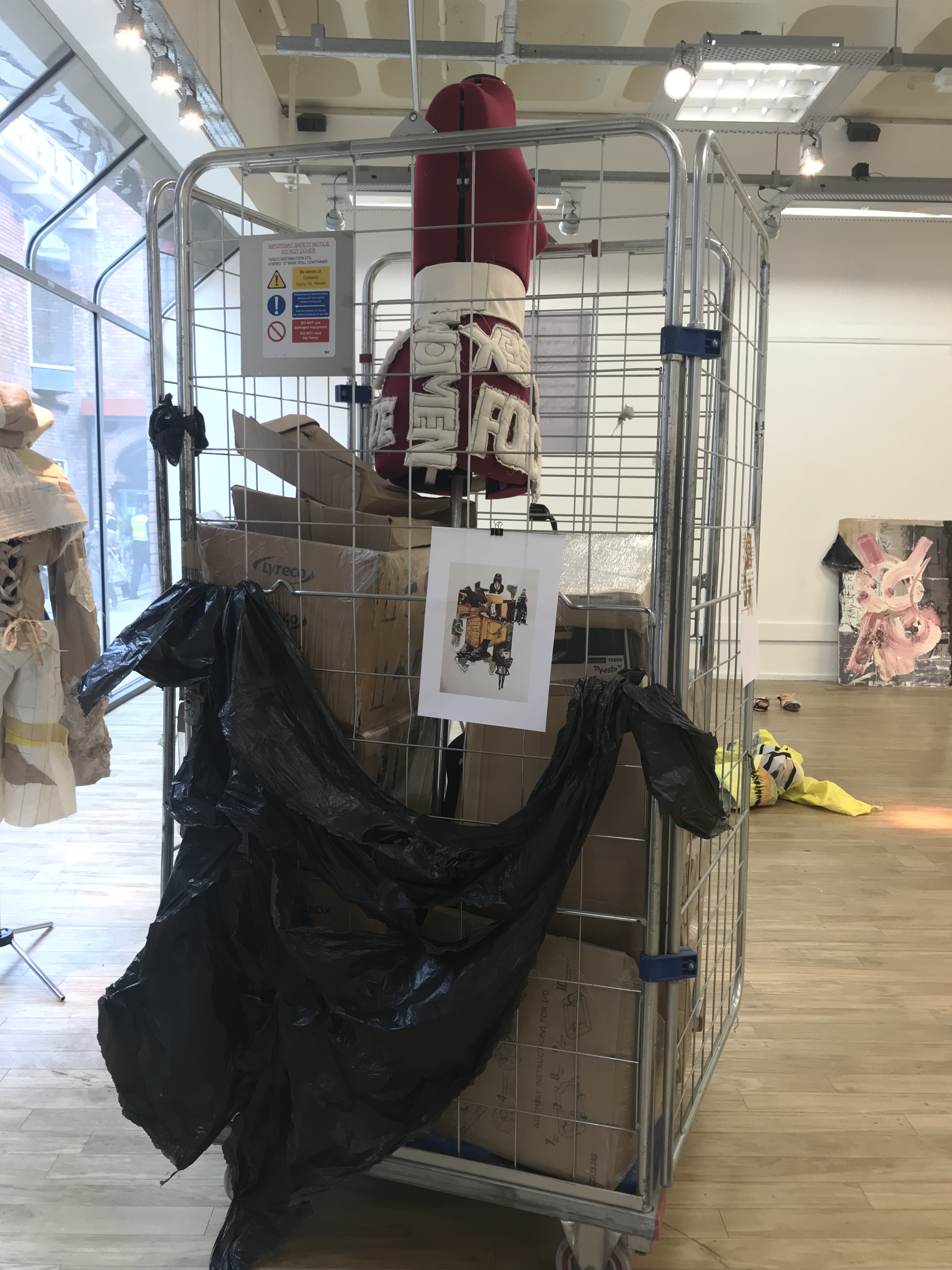
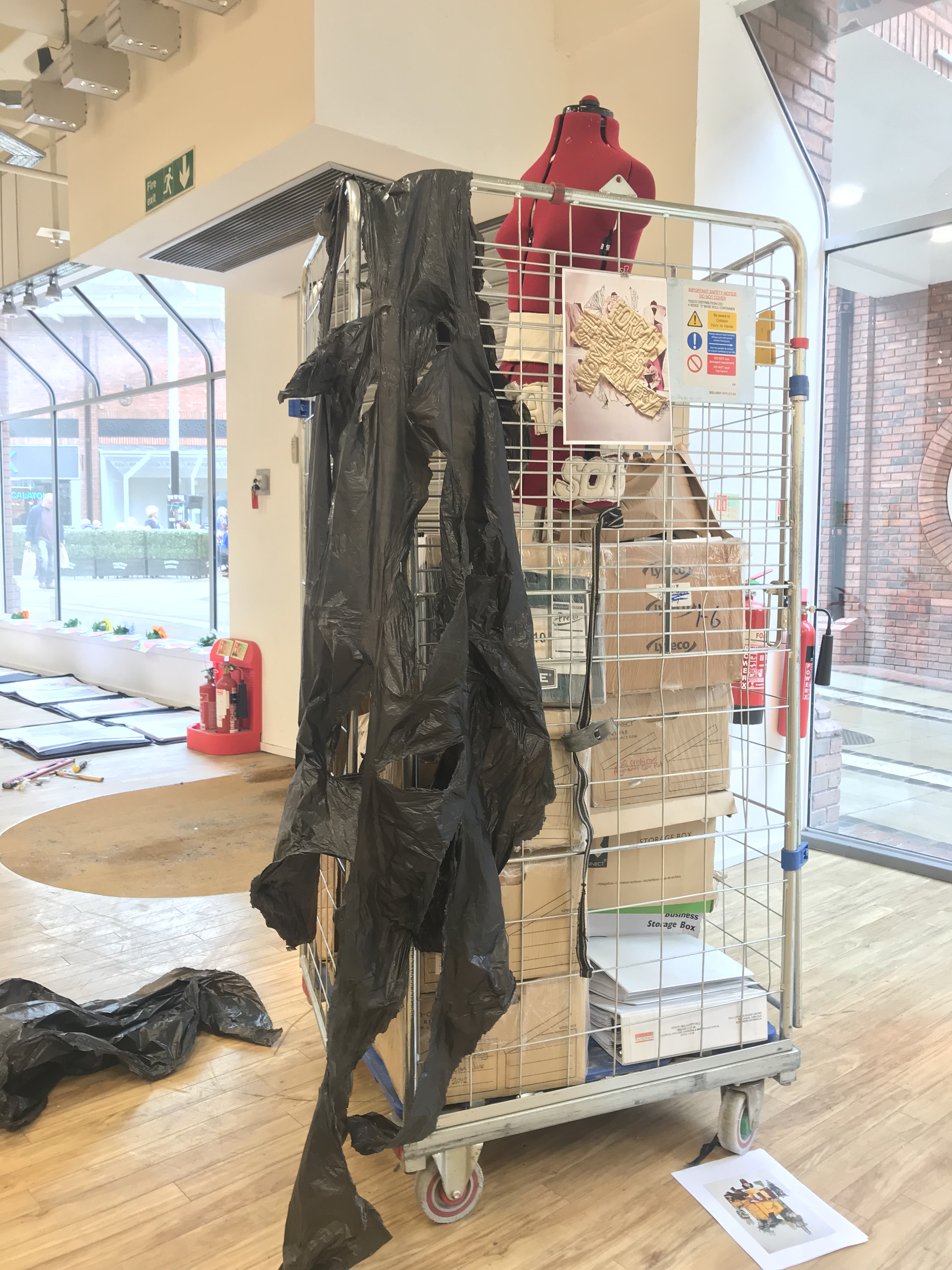
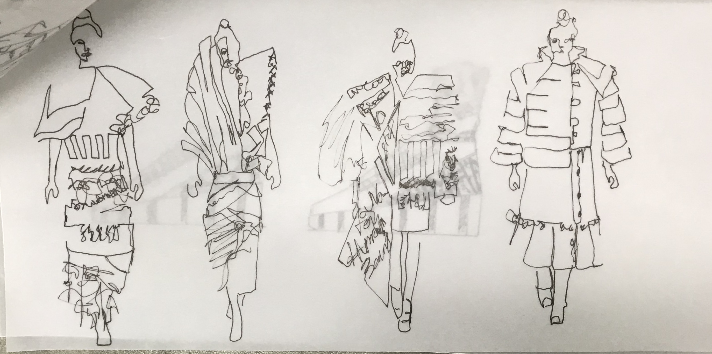
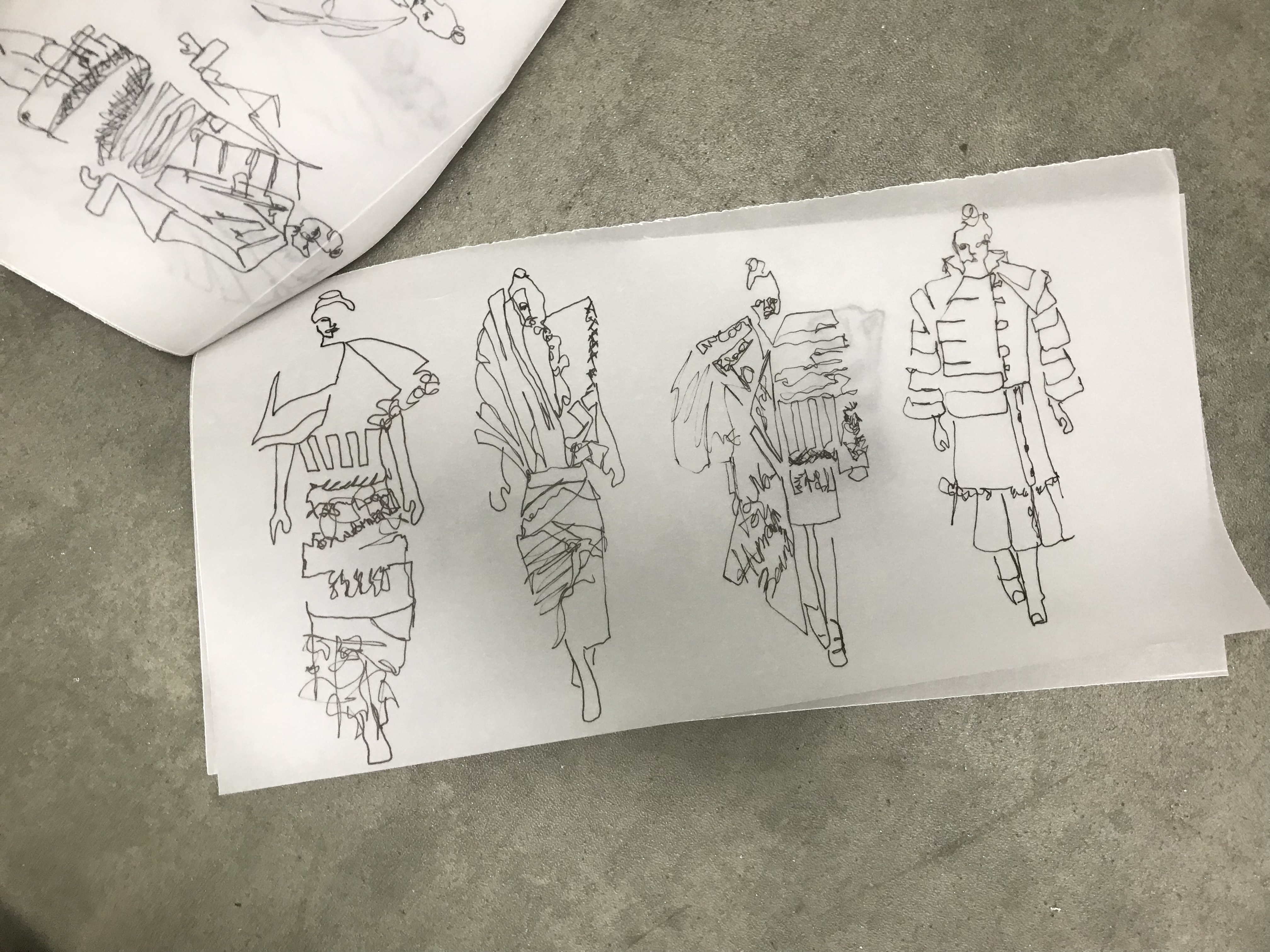
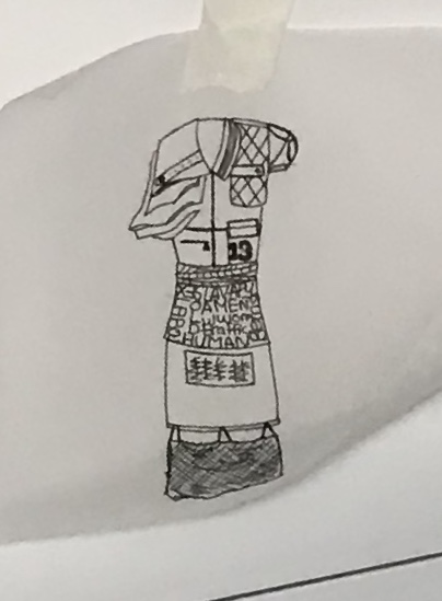
Designers who inspired in creating the word writing on the jacket.

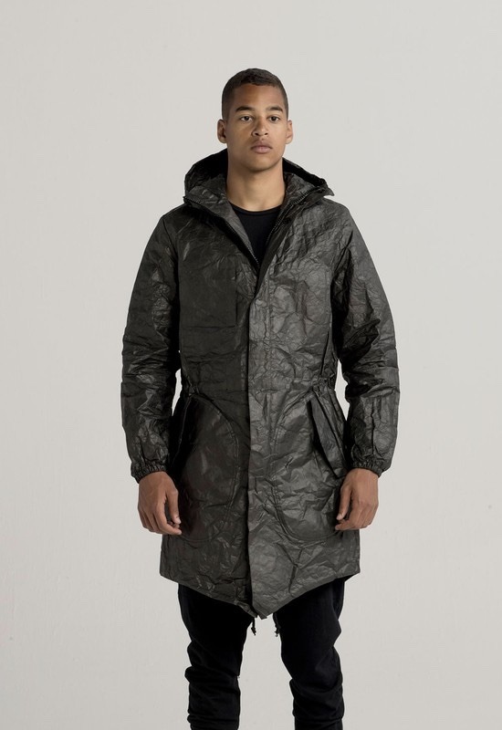
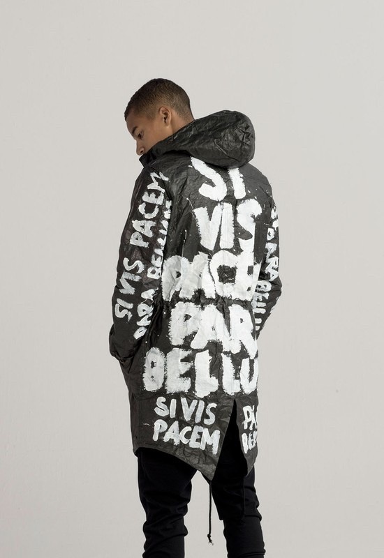
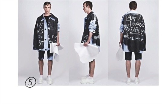
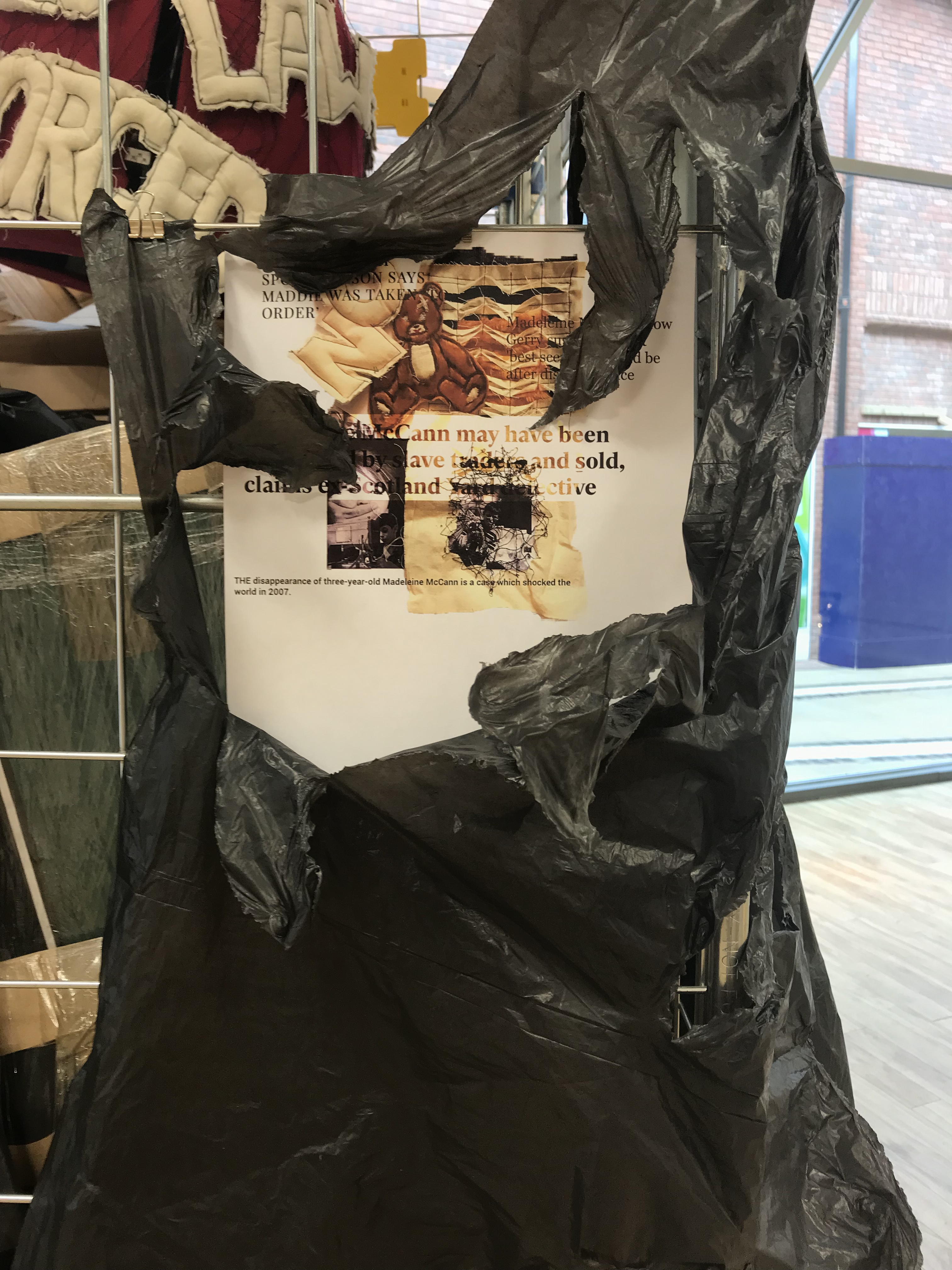
he first wro images are of UEG SS 2015 “para bellum” look book the above first two images are form the look book and what caught my eyes is the material of the jacket, the black mater of the jacket is very similar to the plastic material which I created in my previous project (Hung, Drawn and Quartered) by melting black bin bags using iron. Another element which I like of the jack are bold white paint Ed brush stroke fonts which is a good way to convey a message.

And the last image is of Tigran Avestisyan graduate collection and what I like form it is again the fonts this fonts are different from UEGs fonts as this fonts are not bold and are more hand written then the brush strokes on UEGs collection.

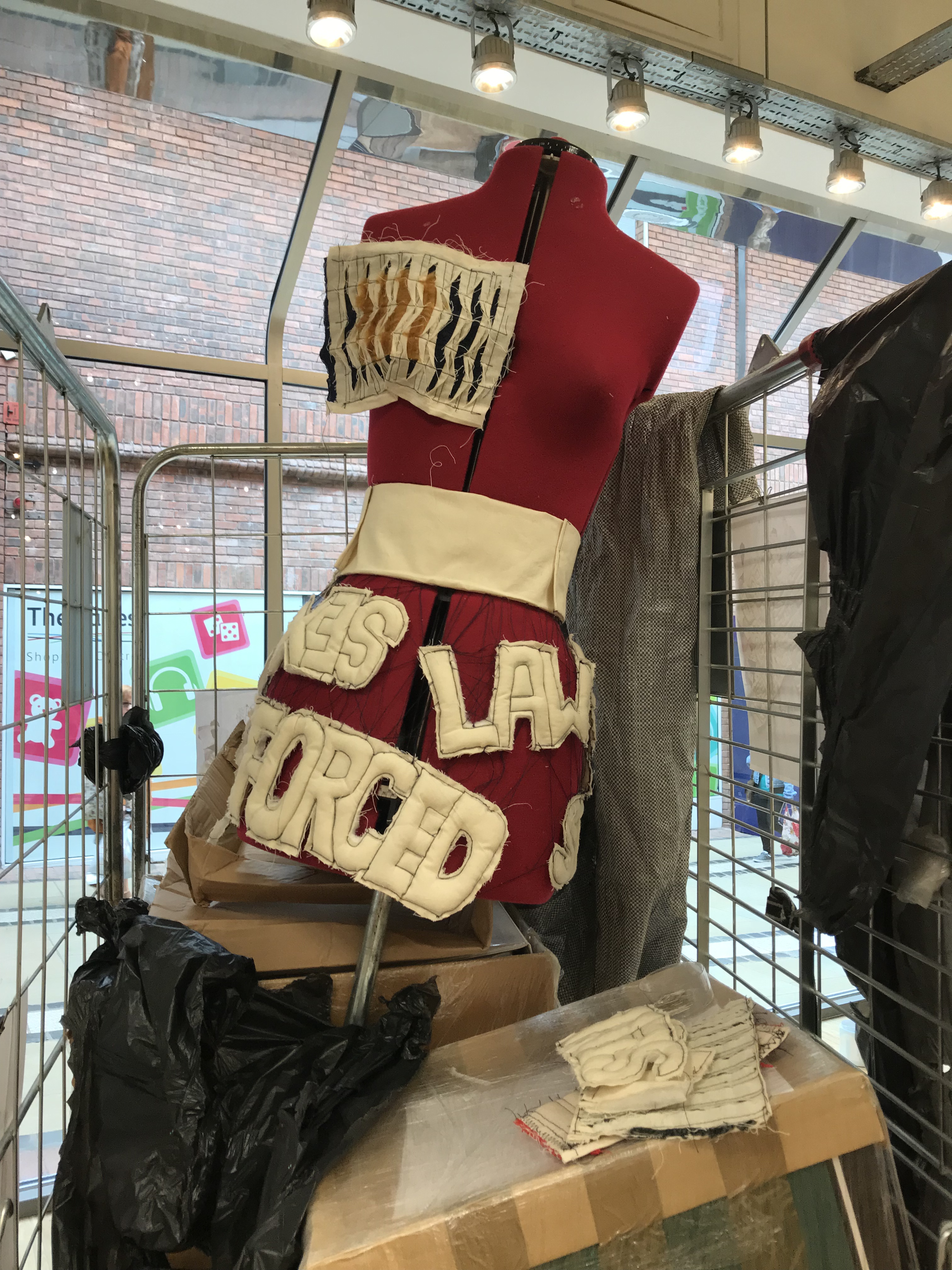
This two designers inspired me to create thepainted sample using brush strokes by including words and numbers on the jacket.

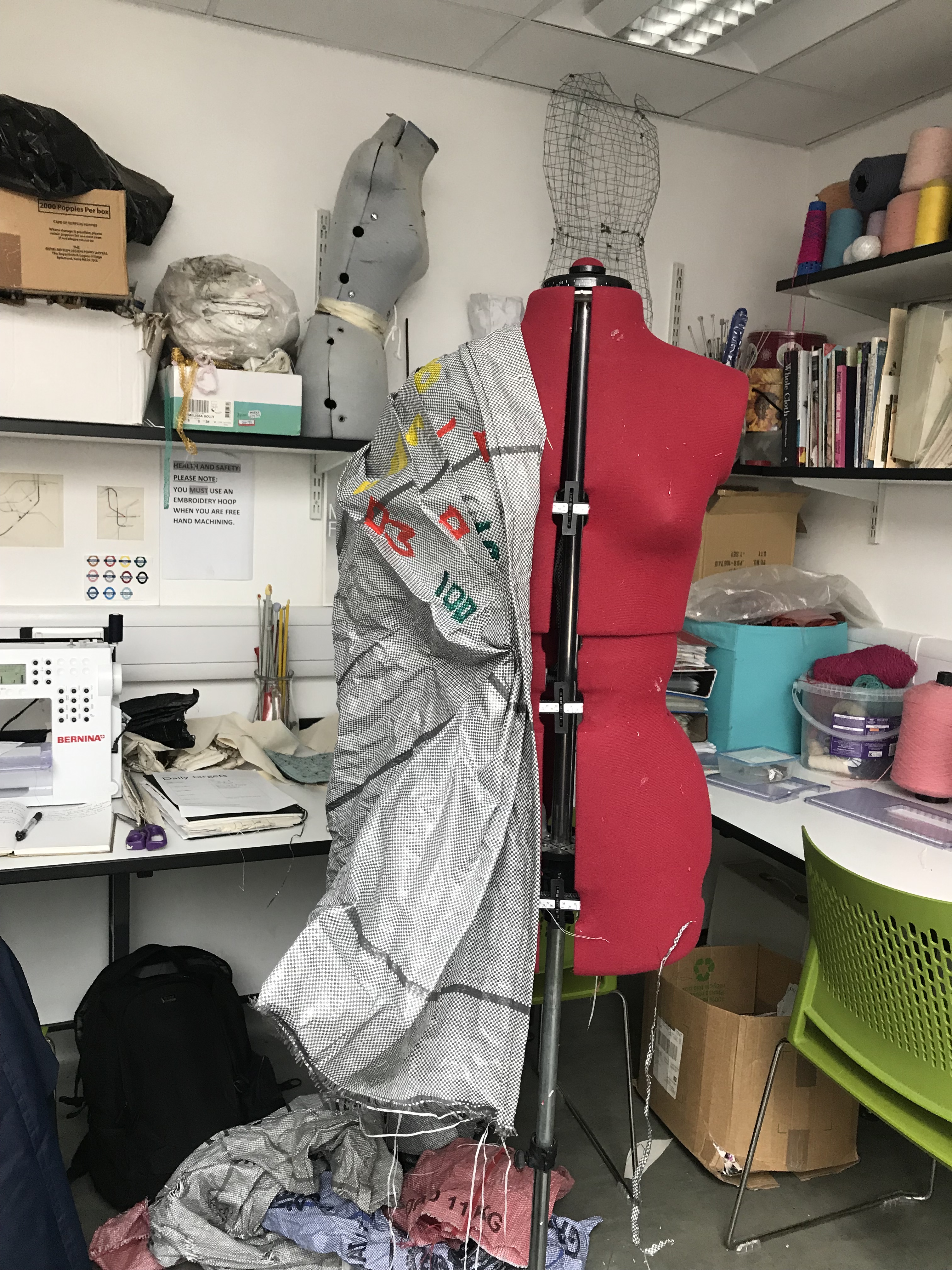
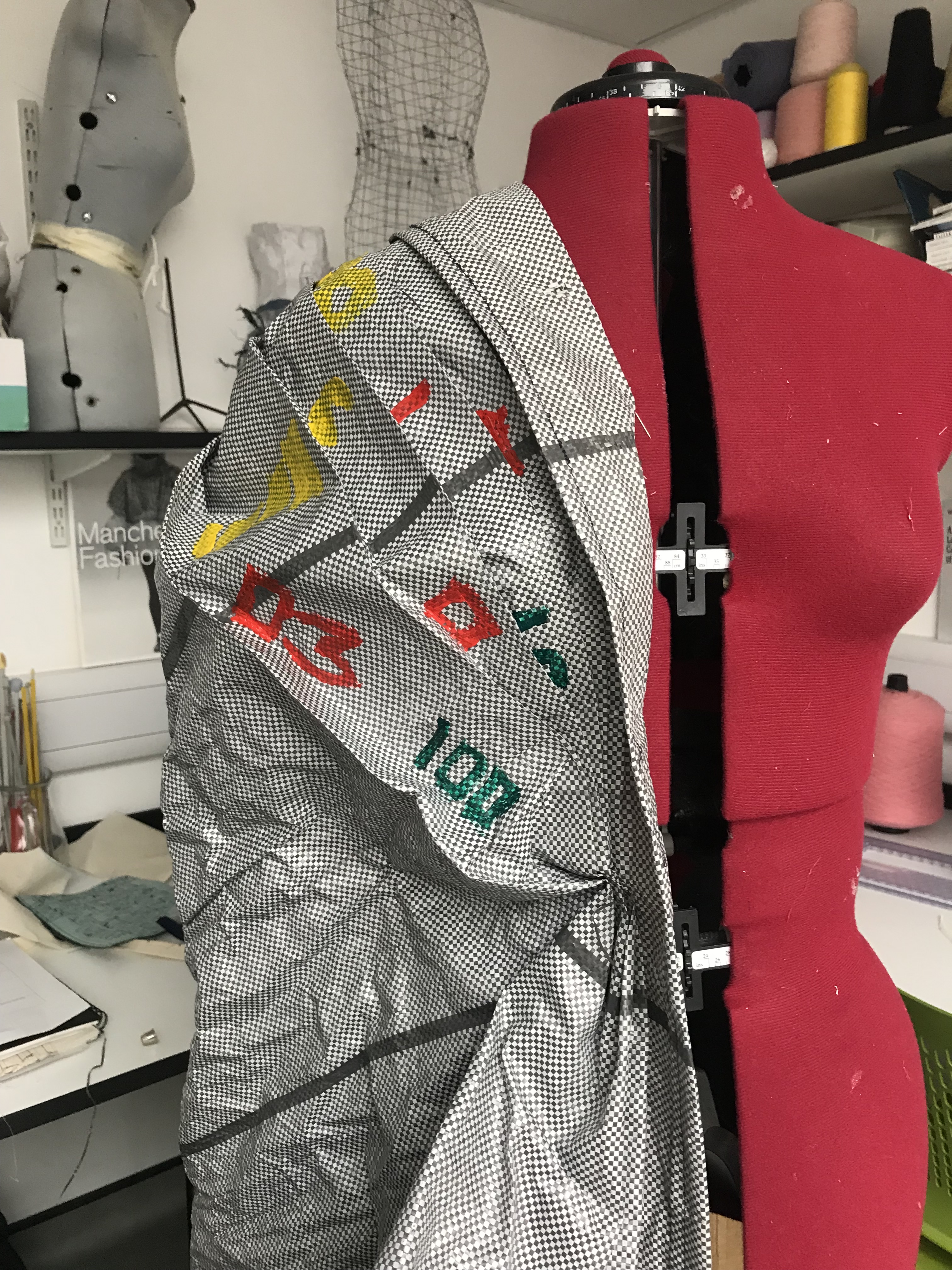
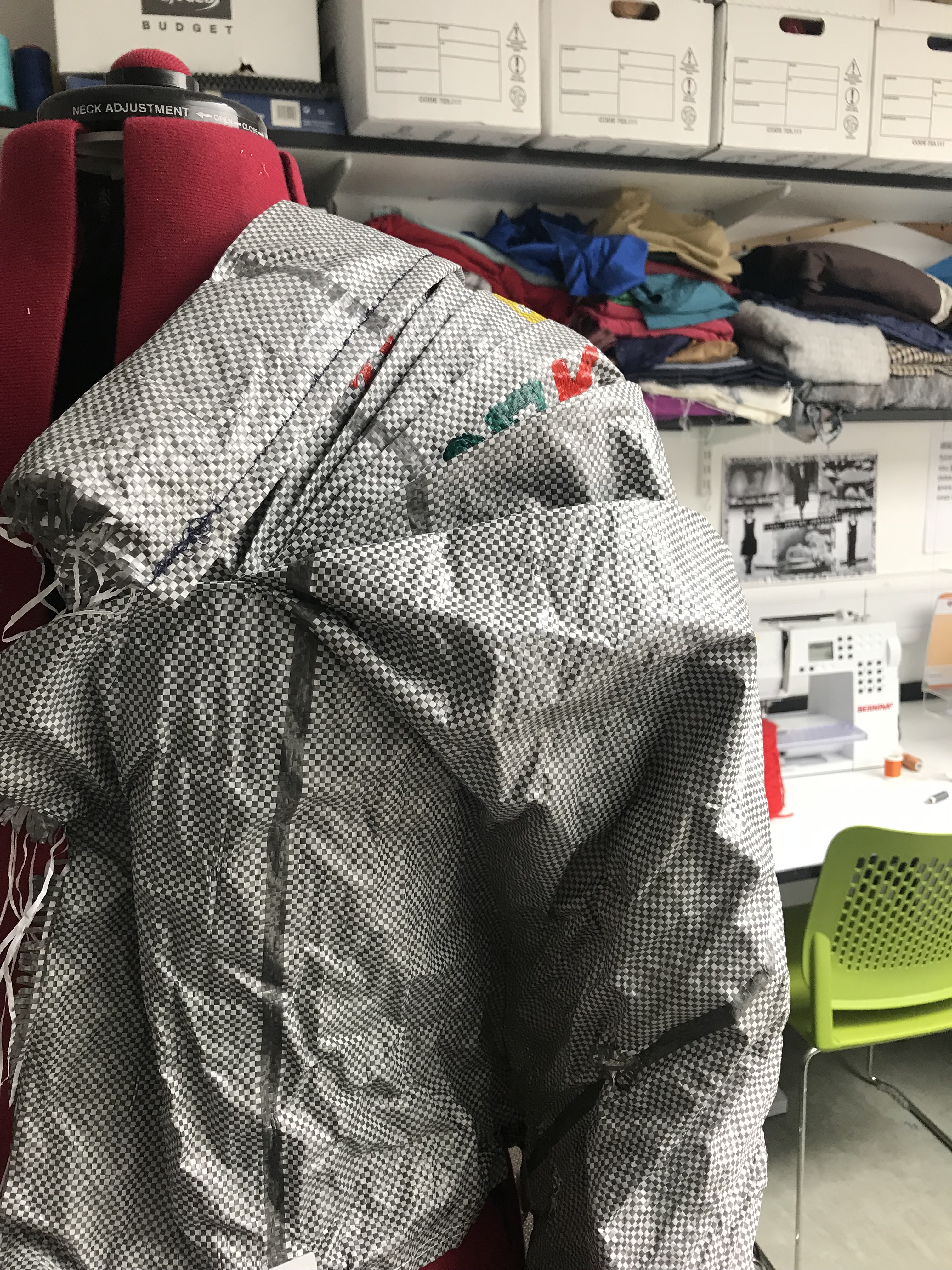
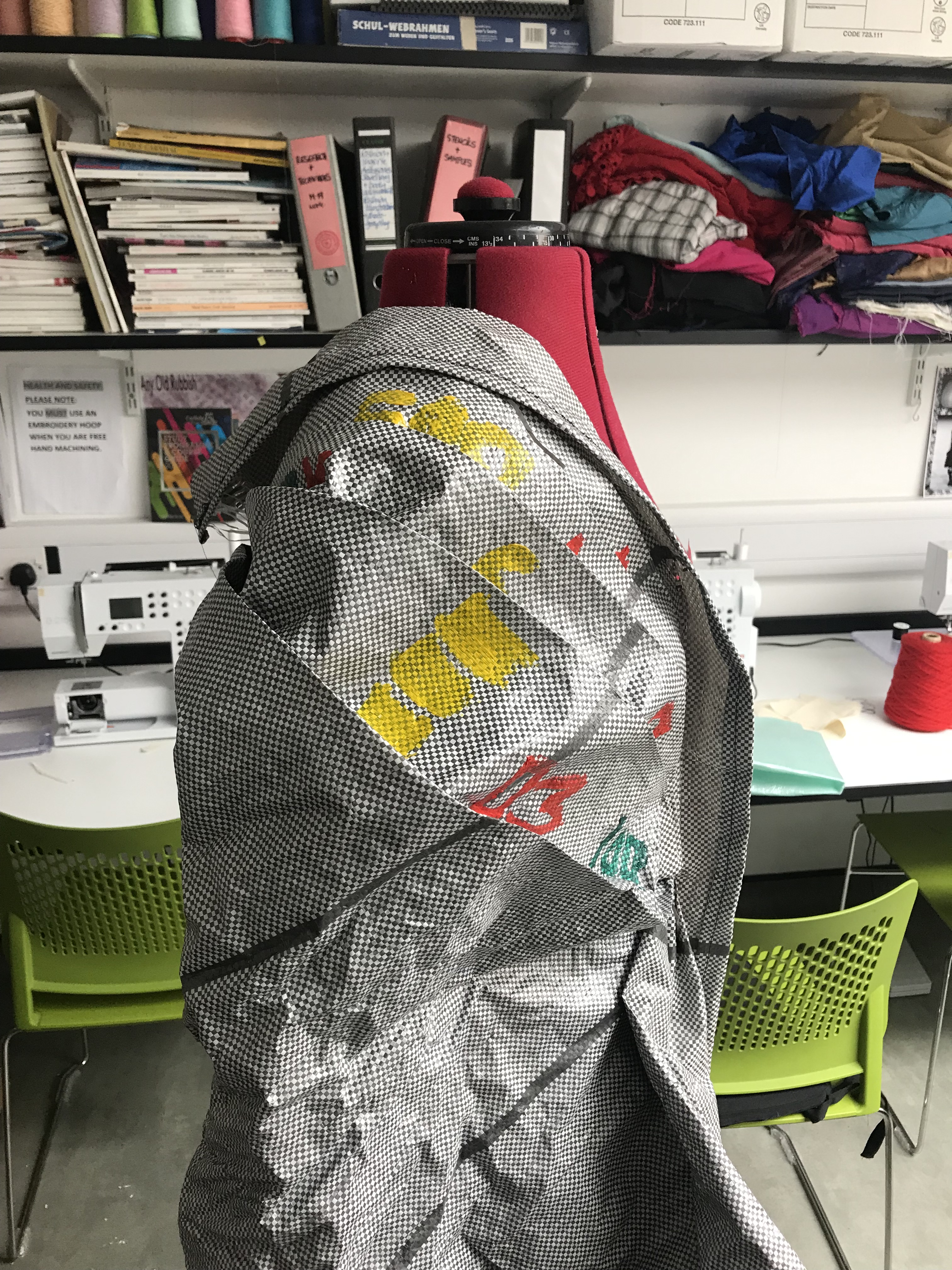
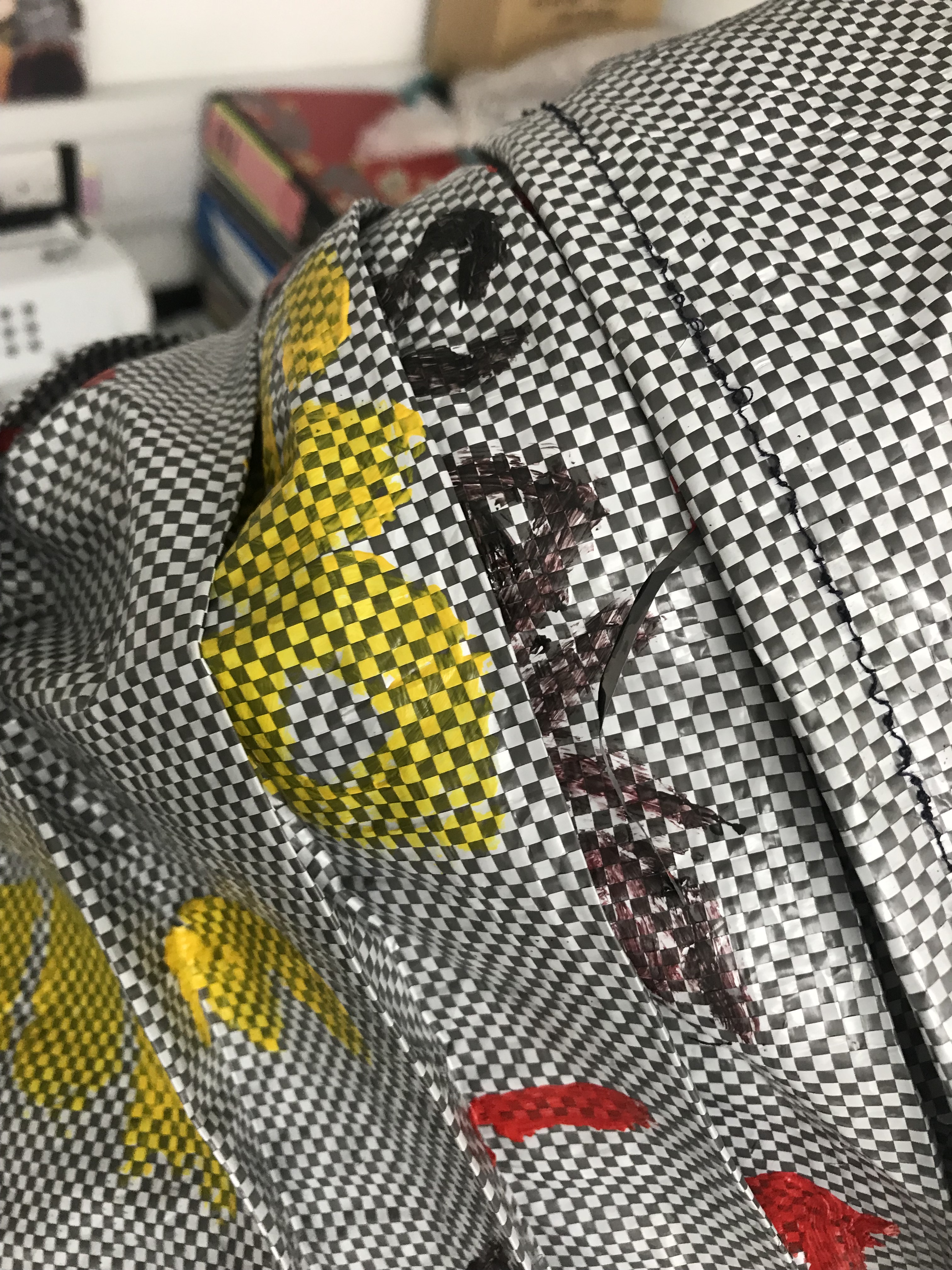
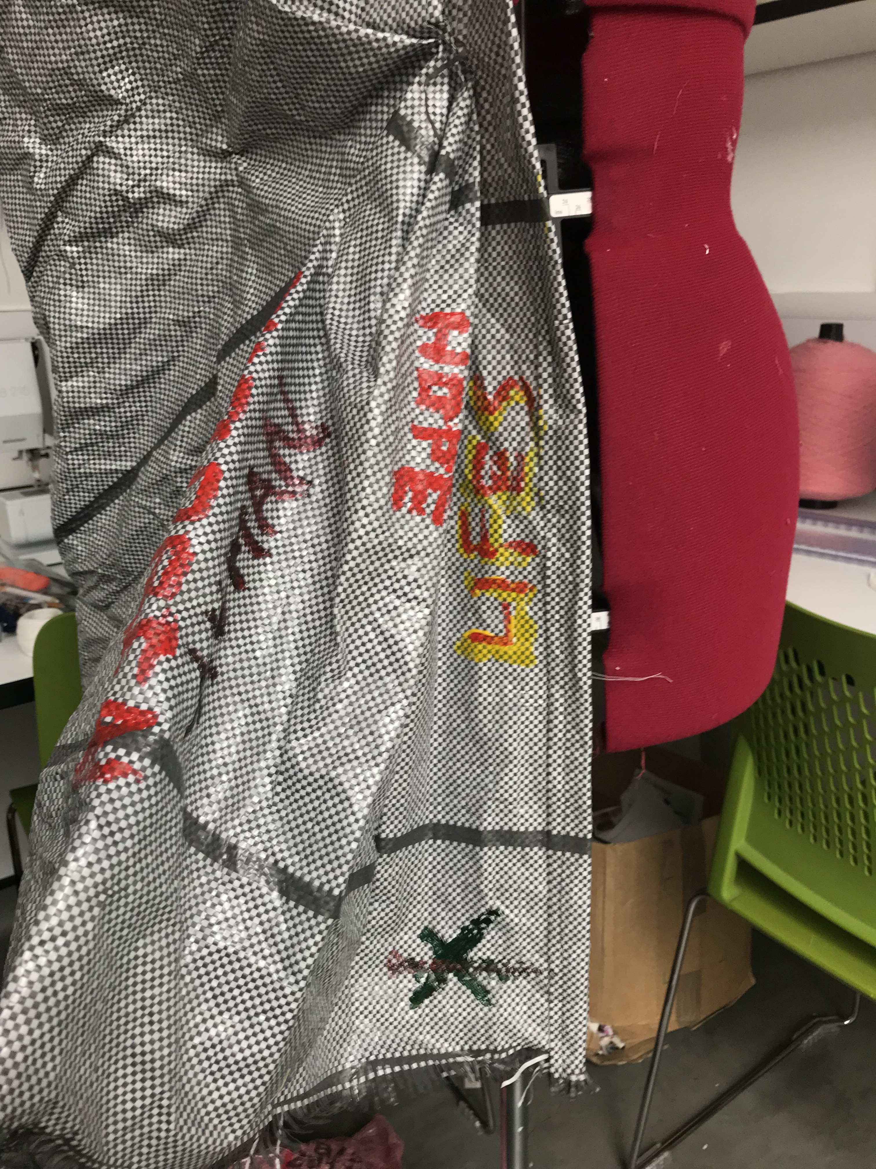
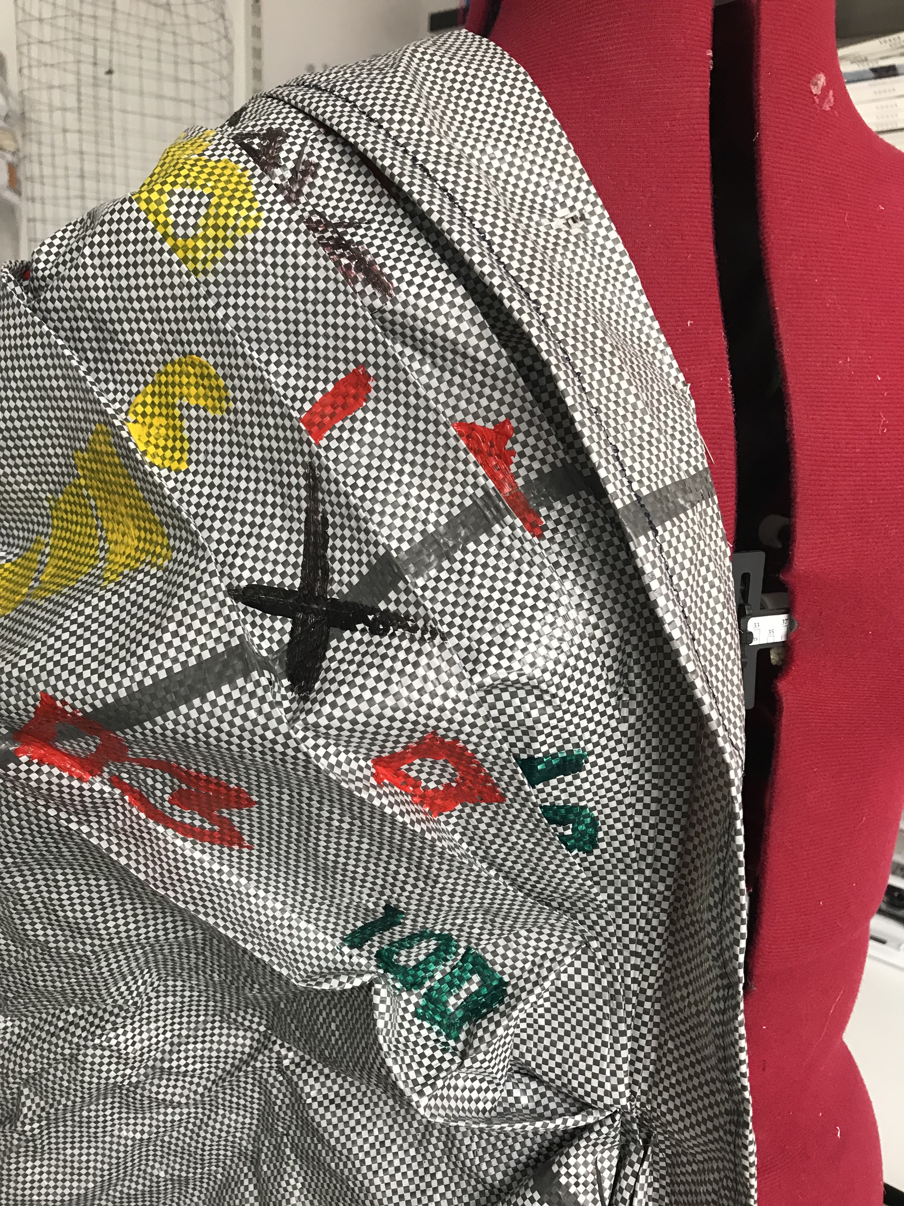
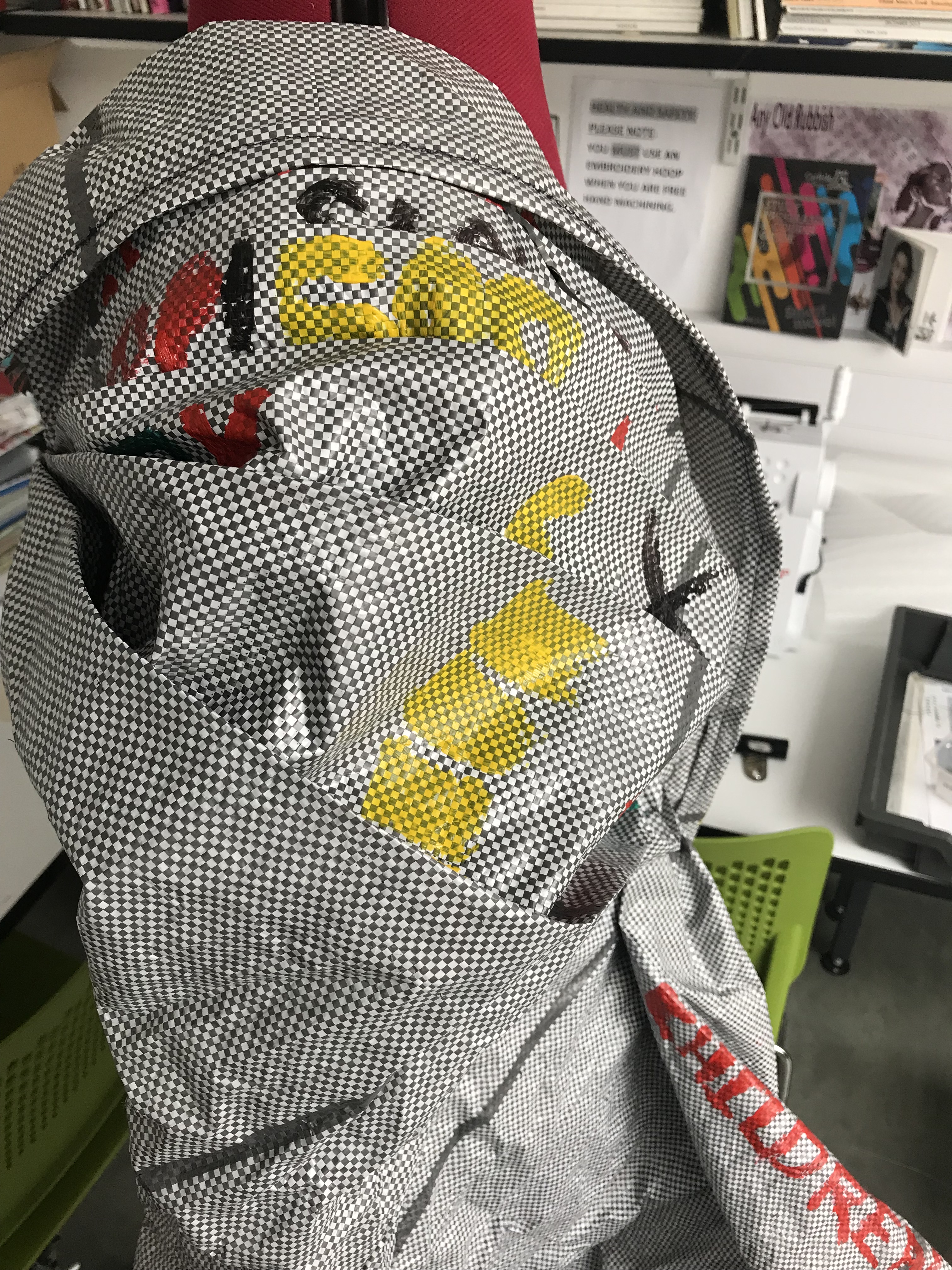
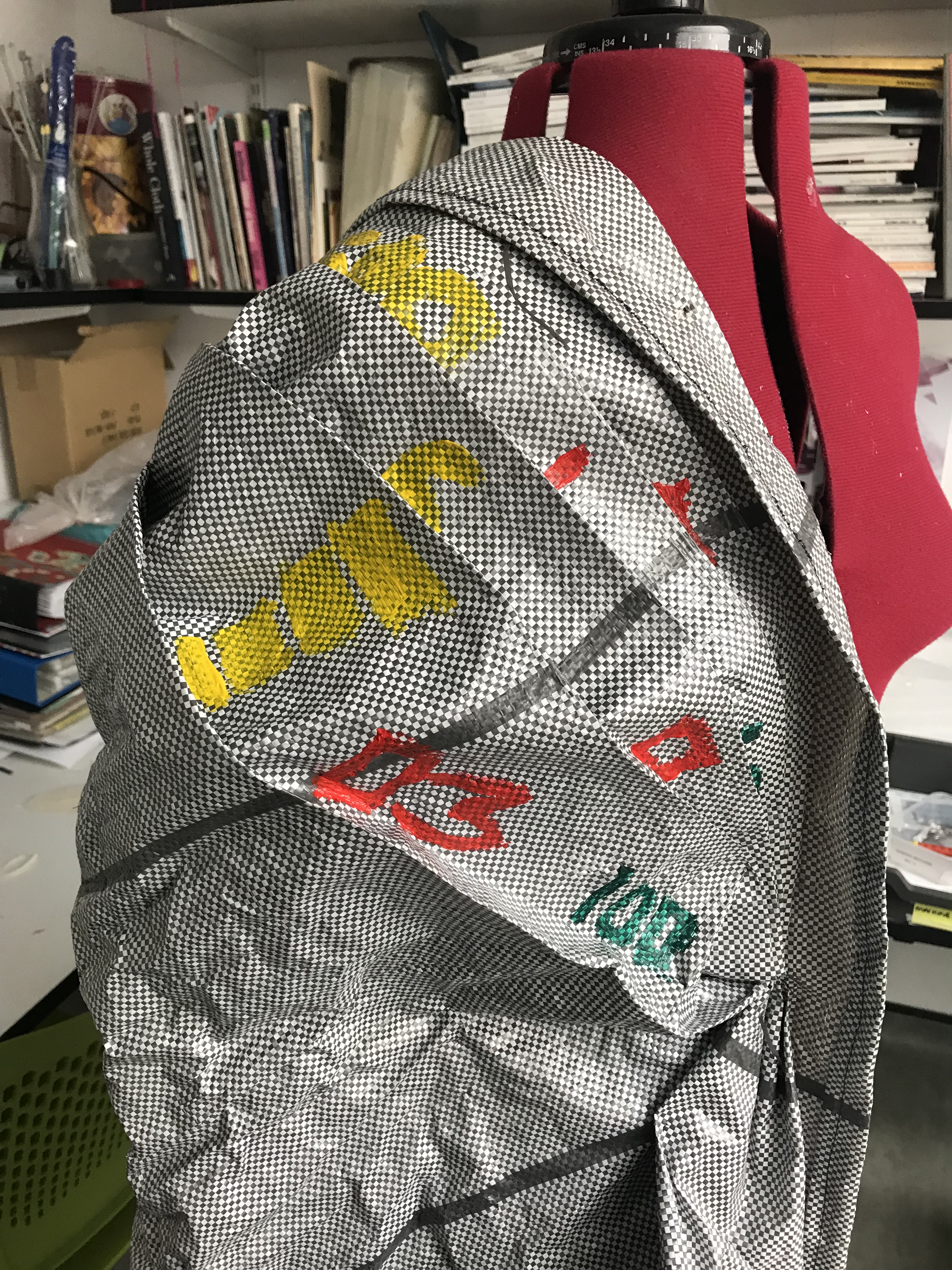
Moving on from the plain jacket, I decided to experiment with colour by painting numbers and few word on it in product brush strokes, in styel of UEG (Para Bellum).

Newspaper sample

Draping using actual newspaper:

Sampling using tabloid newspaper setting it in different shapes and position to see how it looks I like the first image with sharp lapped look to it almost like an ancient amor. The second image with the cresses is another sample which I would like to use but it’s simple and has a casual feel and final the corn shaped paper pattern on the waist and on the chest is another eye catching design which stand out.

Power dressing

Is the was you present yourself by dressing as to show authority especially when working and in political environment which is domain by men

This style of fashion enables women to show their authority and what are they capable of.

https://en.m.wikipedia.org/wiki/Power_dressing

Gareth Pugh and Marc Jacobs :

When observing both of the designers fall 2018 collection the common this is the blazer , trousers and the high wide shoulder as it shows power and also makes the mode in the images look like tough business women who are very brave and inderpandent.

Collage

While scanning through the magazine to find some image to use, I found this article in the magazine:

Arranging/sampling the collage in different layout to get a best final lay out.

The purpose of this collage is to show the type of trafficking: abduction of children, forces marriages and so on.

Current progress

Currently the project is on a mixed level which include some research, samples, draping, and toiles, the stage also includes final designers ad colour pallet for the garment, presently I’m confident with the design that I want to produce as my final outcome. To conclude the final decision I have to confirm the colour palette and the prints which will be included in the design.

change in plan:

In the proposal l had discussed about what my focus is going to be on trafficking which included not one but exploring all type of trafficking issues. So a the current stage I have changed my mind and would like to target sex trafficking and empowering of women further in my project. Further on I will also include some glims of other trafficking issues which I have researched. Concluding this route in the project will be great as I will be able to concentrate on on issue with adding bits of other issues.

Berthold

Designer who inspired me to move from the stuffed words hanging skirt to this style.

The first to image above are very street style and with the bags included in with the outfit gives a feels of caring heavy weight, can also be a great idea to present homelessness, as you travel with all the essentials in the bag it the beige colour, cargo pant pocket, cap and bags all in a uniform colour pallet (similar colour) reflects a soldier appearance.

The second 2 images are the one which strikes me, the jacket on the right is a padding outline kind a like an embroidery saying Berthold which I really like as it is very clean and has a smooth finish.

the process of the mini skirt:

the progress from the first sample: the word sample to the hanging word and finally the padded embroidery which I personally thing is the strongest out of the all; as it is detailed and subtle is what I like about the mini skirt, as the stitching too doesn’t stand out as I have uses a navy blue thread which blends with the black plastic material.

overall I think this is that last and finally stage for the padded mini skirt as my final decision is to use third sample inspired by Berthold as my final skirt design.

Yinka Shonibare

Yinka Shonibare: ‘is a British-Nigerian artist living in the United Kingdom. His work explores cultural identity, colonialism and post-colonialism within the contemporary context of globalisation’.

Yinka Shonibare’s work is very colourful and cultural, some of his sculptures are made of cultural fabric and the others look like fabric but there are either made of fibreglass a or other material which are then painted in the fabric colours and patterns onto the sculptures which is not notable and makes it look like real fabric form a distance. Most of his sculptures have a globe cranium or the sculpture on a globe, which means relating to issues that are globally.As a concept can be used in my project as human trafficking is a global issue.

Drapes:

Some of the drape samples which I created in cultural and colourful material. I would love to use this colour in some parts of my design as the bright colours are very eye catching and can also have different means

Exhibition ( The lanes)

We had an opportunity to present our work in the shopping centre in a pop up shop, in which I exhibited my FMP project work.

Image of the exhibition:

The image above shows the process of me setting my exhibition; all the images present different ways in which I tried to present the stand in or outside the cage. Just only starting my project I did not have many samples so used the few samples which I had created at the start, used it to cover the upper part of the stand. I also include some images/ research around the cage and kept on changing them around until I get a layout which I liked. Concluding, this exhibition has helped to to think further for my FMP exhibition as now knowing what step to go through before making a final call on setting up of the exhibition.

Maxxij

The first two images above are form Maxxij 2018 AW look book what about the pieces is the layerings specially the second image with the puffer jacket oversized, asymmetrical and patched, this idea can be use so show comfort and warmth. The last two image are from the 2010 SS collection the half long length skirt stands out for me and the last image glossy material with word and symbols which can be found on a package box is another interesting idea which can be a possibility for my project to show that the victims are transported from place to place like a package.